Master Course 9 2018 CTOUCH Group Project Desk research, Interviews, Product design, Prototyping, UI, User journey, User observations, User testing & UX
Summary
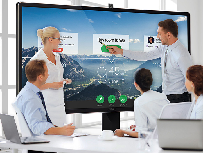
For this course, Usability and User eXperience Assessment in Design, we were asked to redesign the CTOUCH Leddura 2Meet. The CTOUCH is a big screen that is supported by an app. It is designed to be used in a business meeting, performing as a multifunctional big screen. The focus of the project was to improve “tagless teamwork” with the CTOUCH: the event of showing multiple other devices’ screens on the CTOUCH at the same time, and the focus issues that this brings along in a business meeting. To improve the tagless teamwork we first analysed the current product, then we did two rounds of creating a redesign and testing it. Finally, we implemented the results and created a final design of the interface and experience of the CTOUCH screen.
Process
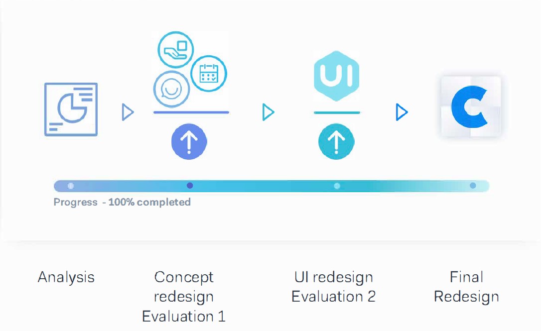
The process of redesigning the CTOUCH consisted of four parts. First, we analysed the current screen and its usage. Then we did a round of redesigning and testing of the screen focussing on the identity and tone of the design. The second round of design and testing focussed on UI and interaction. Afterwards, all the results from the tests were processed and a final design was created.
Analysis
Leddura 2Meet as it's currently being used
The first step towards redesigning the CTOUCH was to analysis the current product and its context. The goals were to find areas where the product could be improved and what should be kept the same.
Current Usage
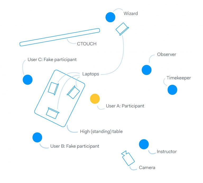
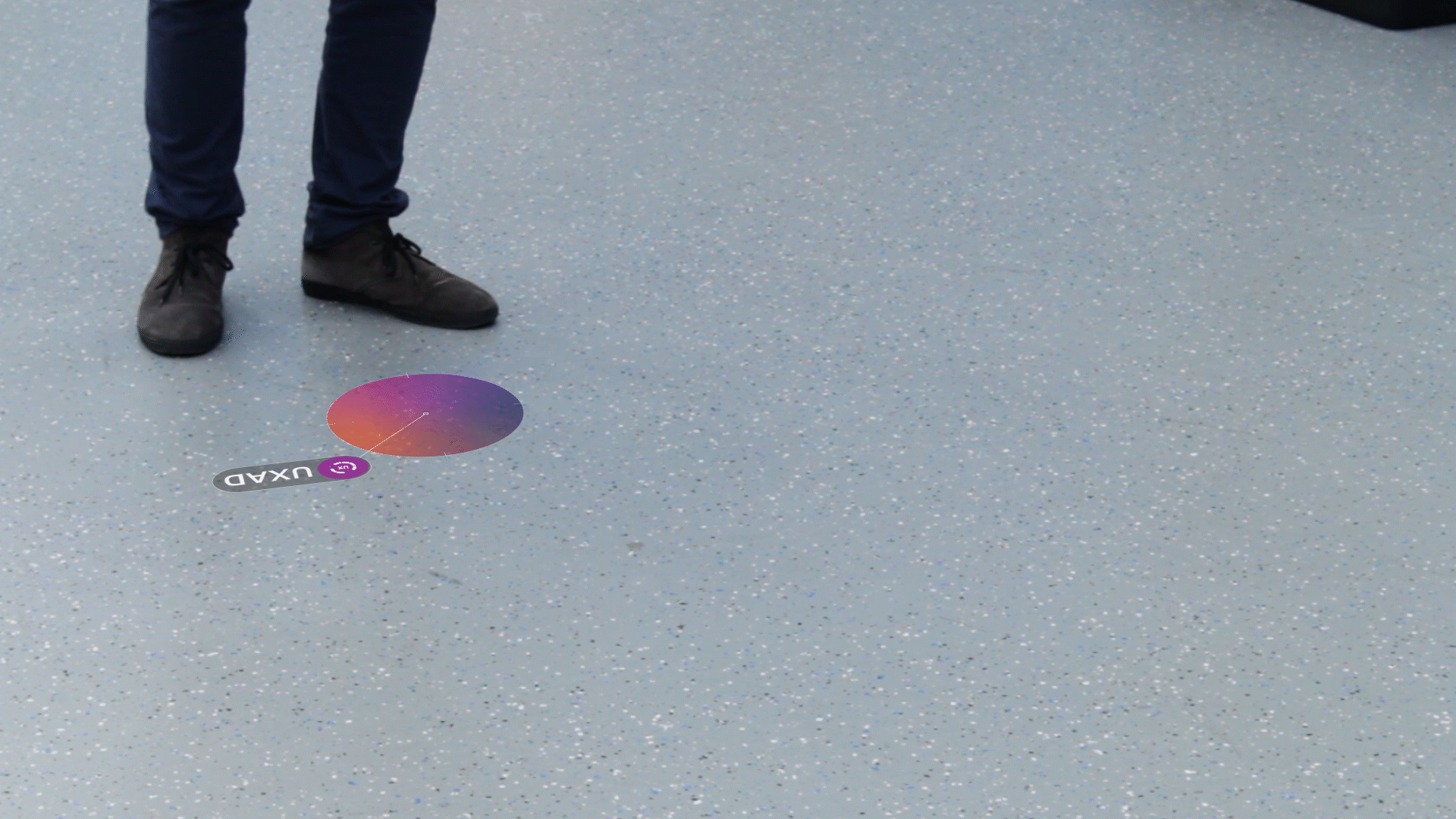
To analyse the product we created a storyboard of how the product is currently being used. Along with that, we created a visual of the flow within the software of the CTOUCH. To get an idea of how good the screen currently performs we did a cognitive walkthrough and peer testing.
Interviews & Observations
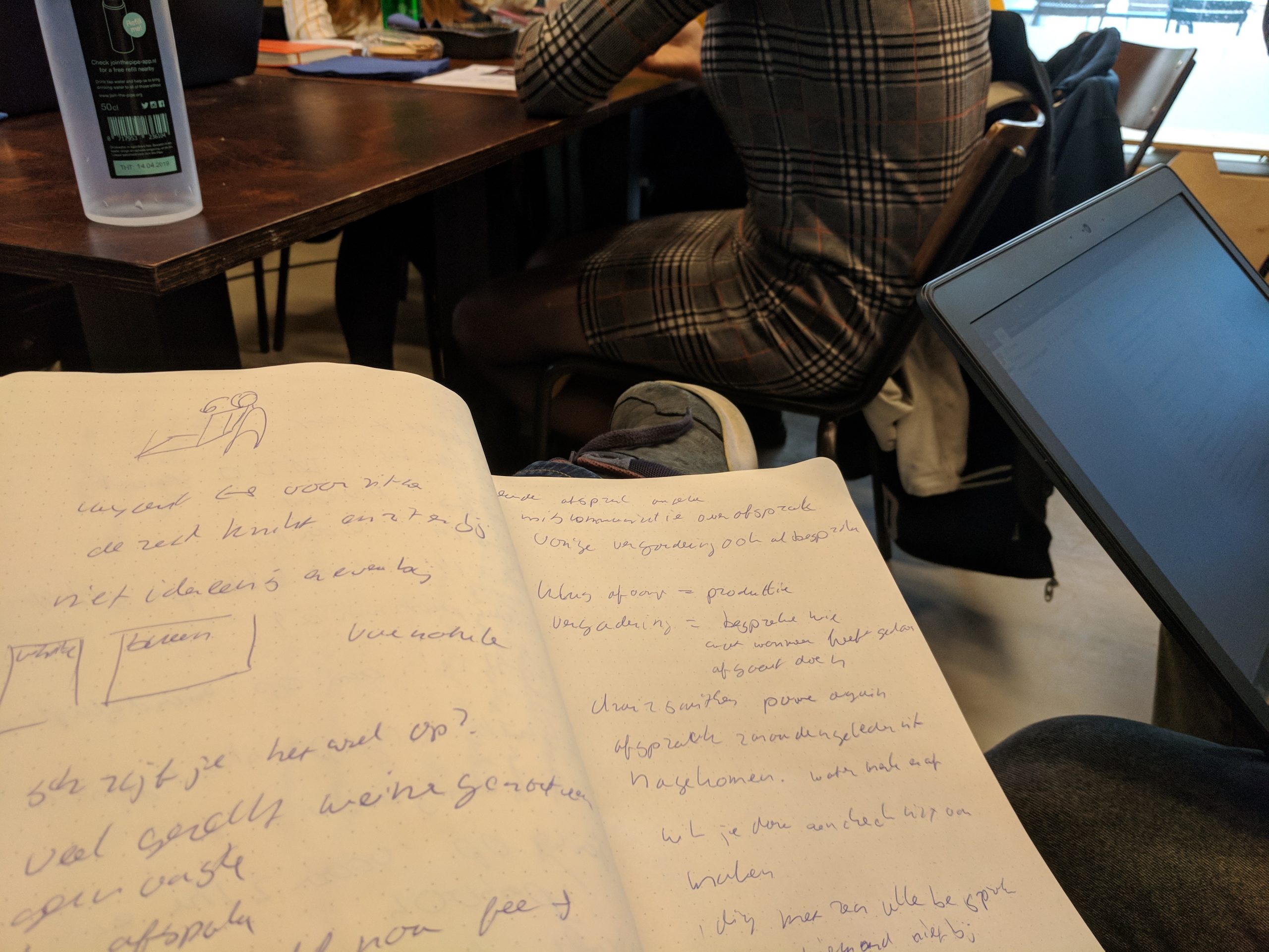
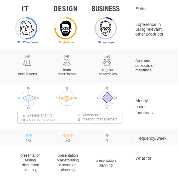
We also wanted to better understand the context in which the CTOUCH is, or could be, used. To do so we send out a questionnaire, did interviews and observations. The questionnaire was about the dynamics of a group during a meeting. The interview was to help us better understands how the CTOUCH could be useful during a meeting and what kind of features is would need. We also observed meetings to understand the flow and dynamic within such meetings.
Persona's & Storyboard
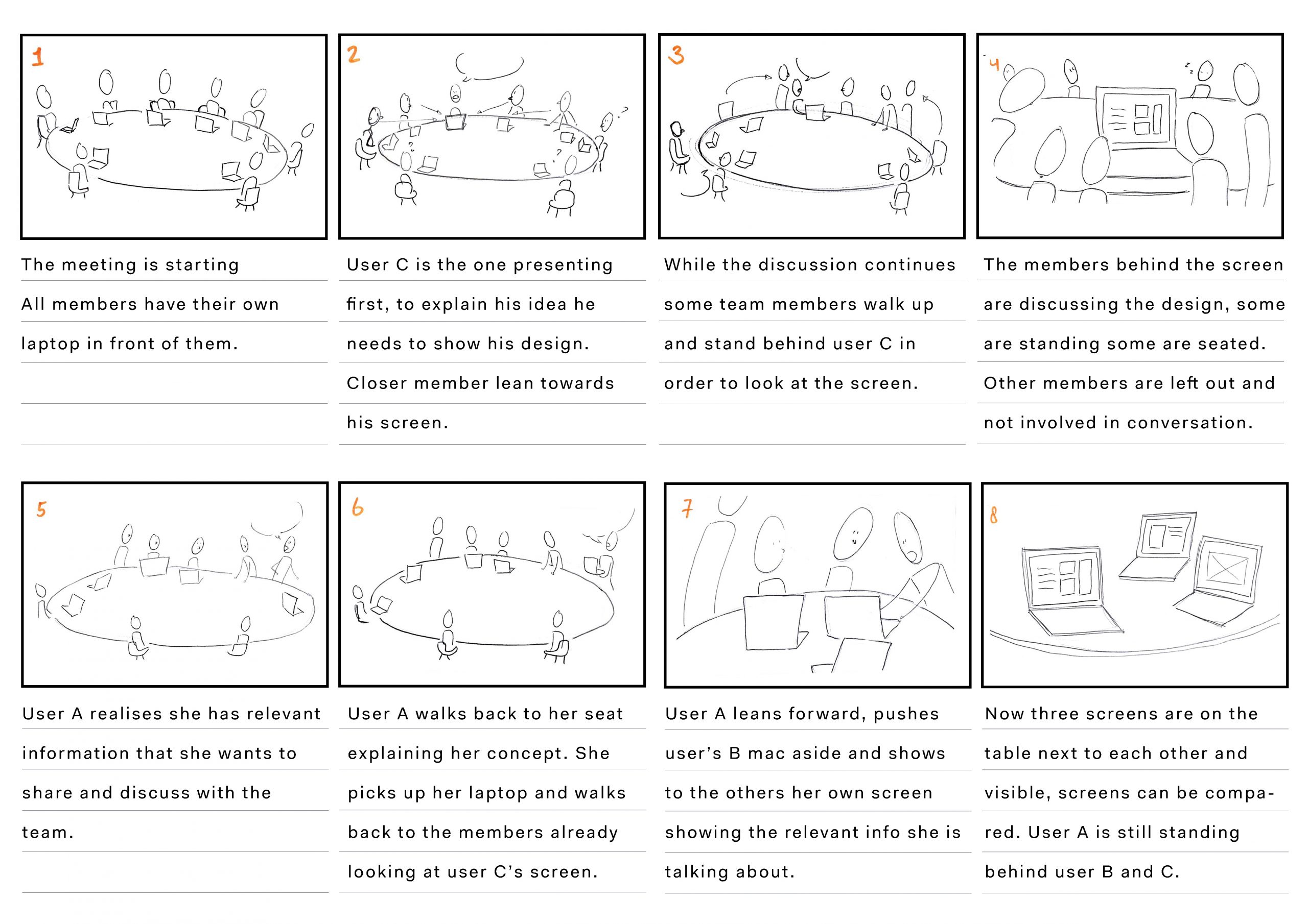
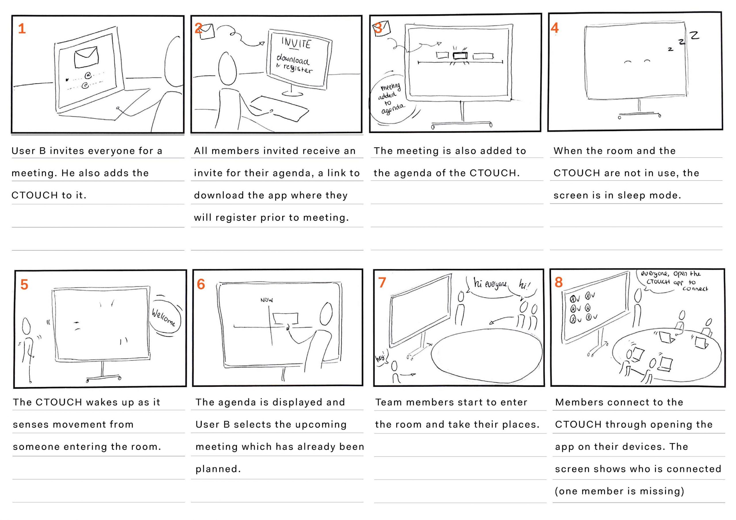
Based on the results of the research, three persona‘s were created. Each persona represents a different usecase of the product. We also created two storyboards, one representing a meeting without the CTOUCH, and the second representing a meeting with the CTOUCH as it is. Below only the first storyboard is shown.
Previous
Next
Based on the performed analysis we came to the following problem statement and ambition.
Problem Statement
The problem is characterized by two core issues: the user journey of connecting multiple devices and the identity of the CTOUCH Leddura 2Meet during meetings.
Ambition
Interaction with the screen should be fluent and organic, as if the team is interacting with another member
Concept redesign
Identity & Feel
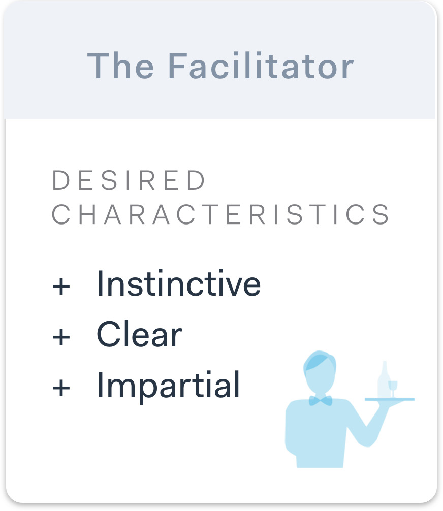
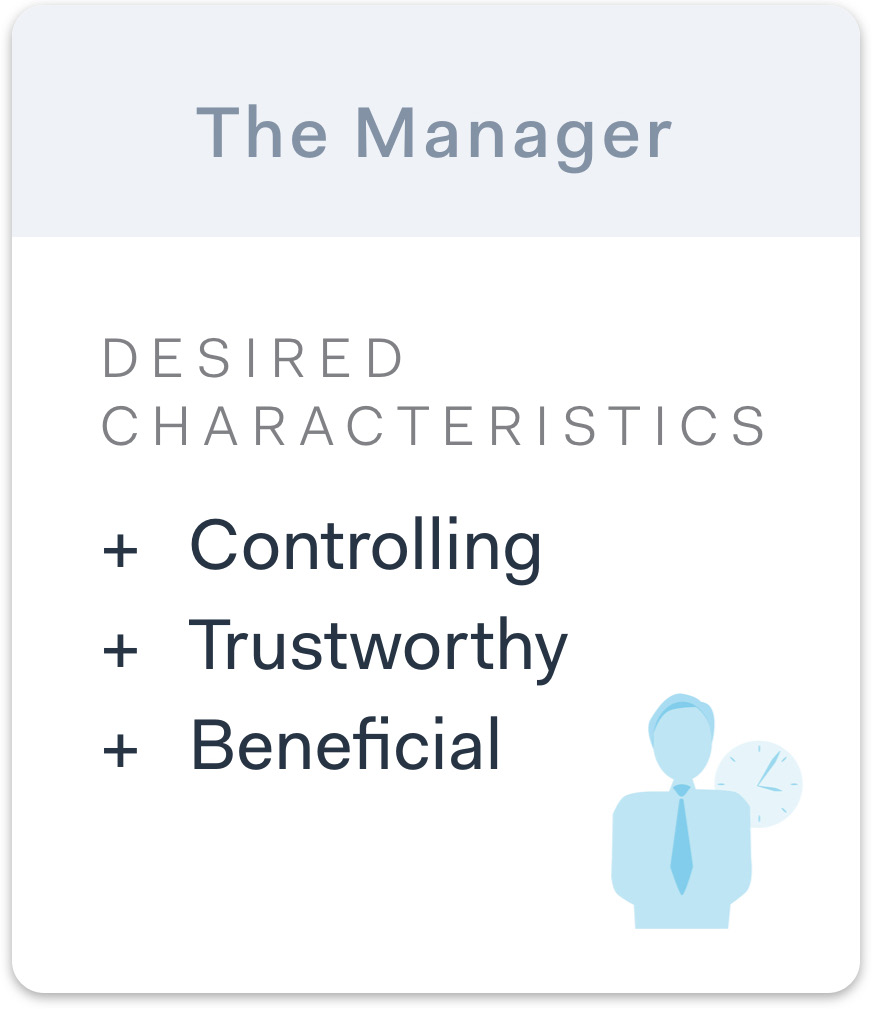
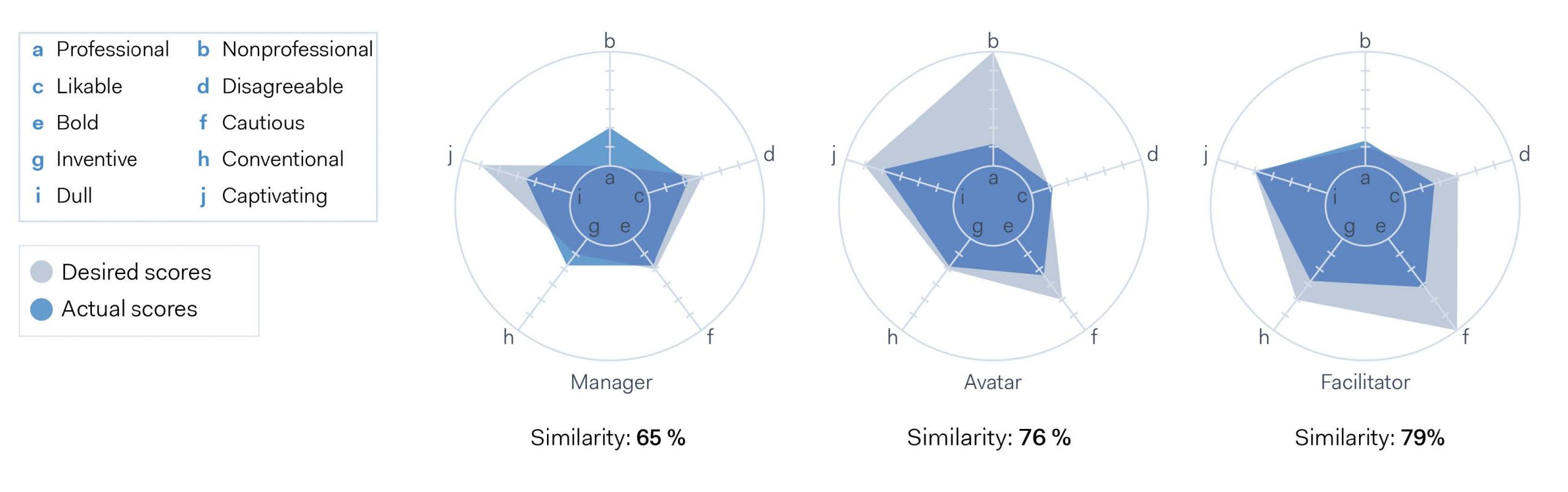
First, we wanted to redesign the overall identity the screen currently has. To do so we created three characters that guided the design and its interaction. The characters are as follow, an avatar, a facilitator and a manager. They differ in that the avatar is helpful and customisable, the facilitator guides the user by providing him with the right information at the right time and the manager is sterner and in control of the meeting, only showing you what he thinks you need.
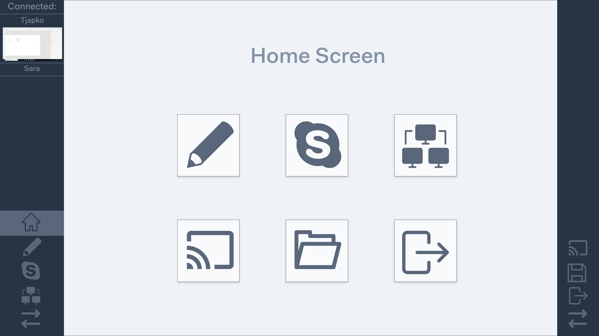
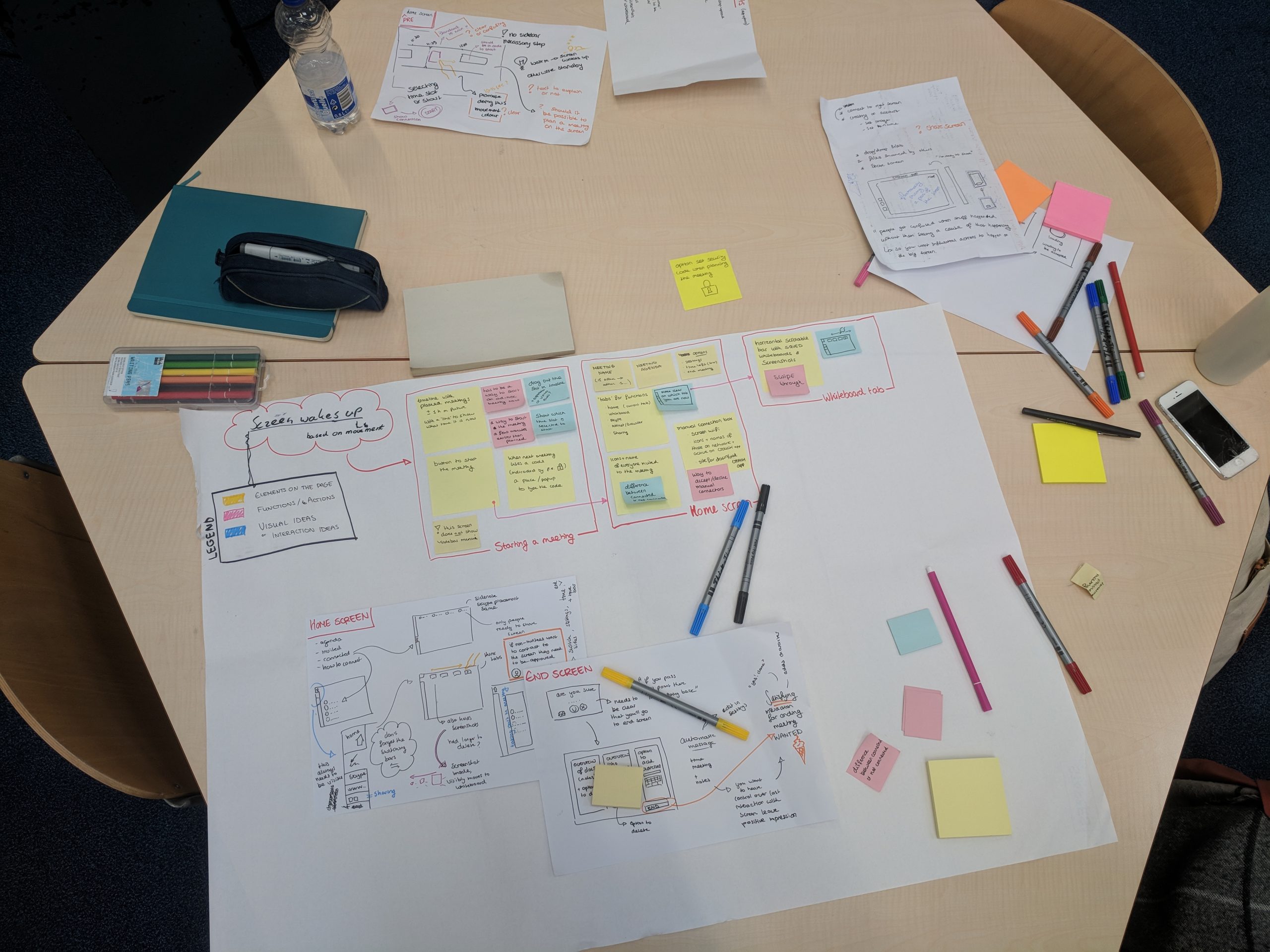
User Flow & Wireframes
For each of these characters, a flow and a set of wireframes was designed.
Previous
Next
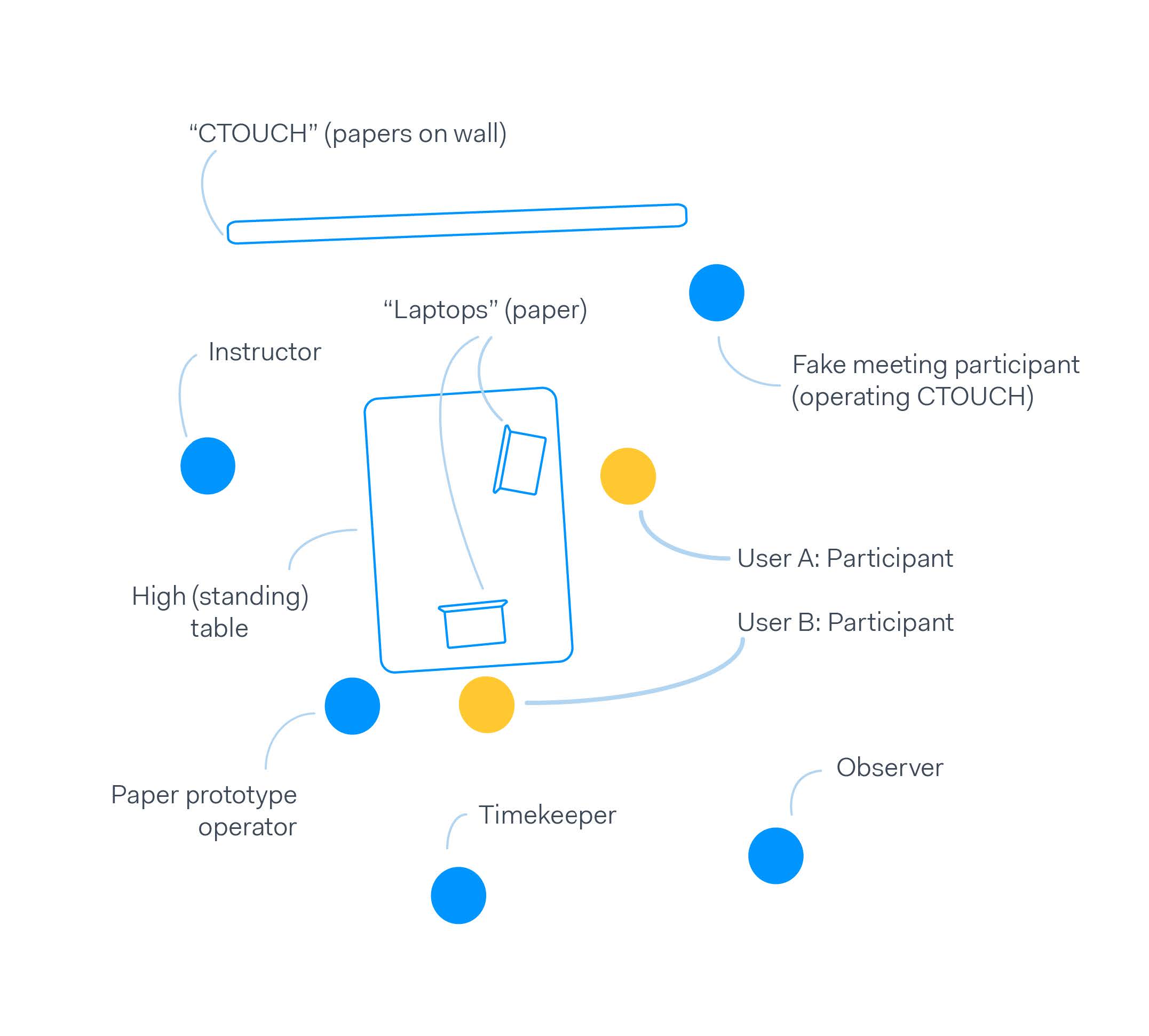
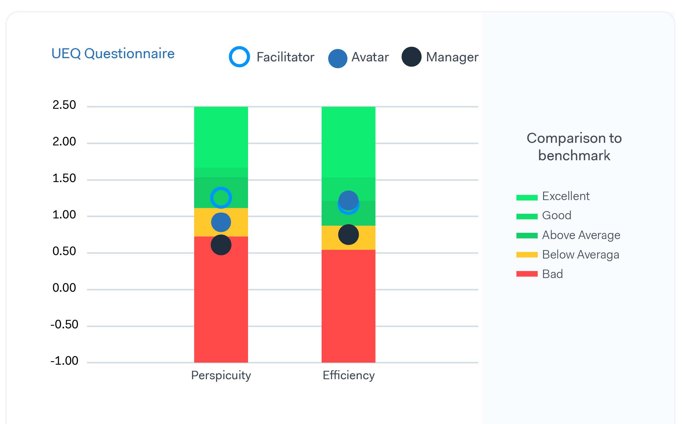
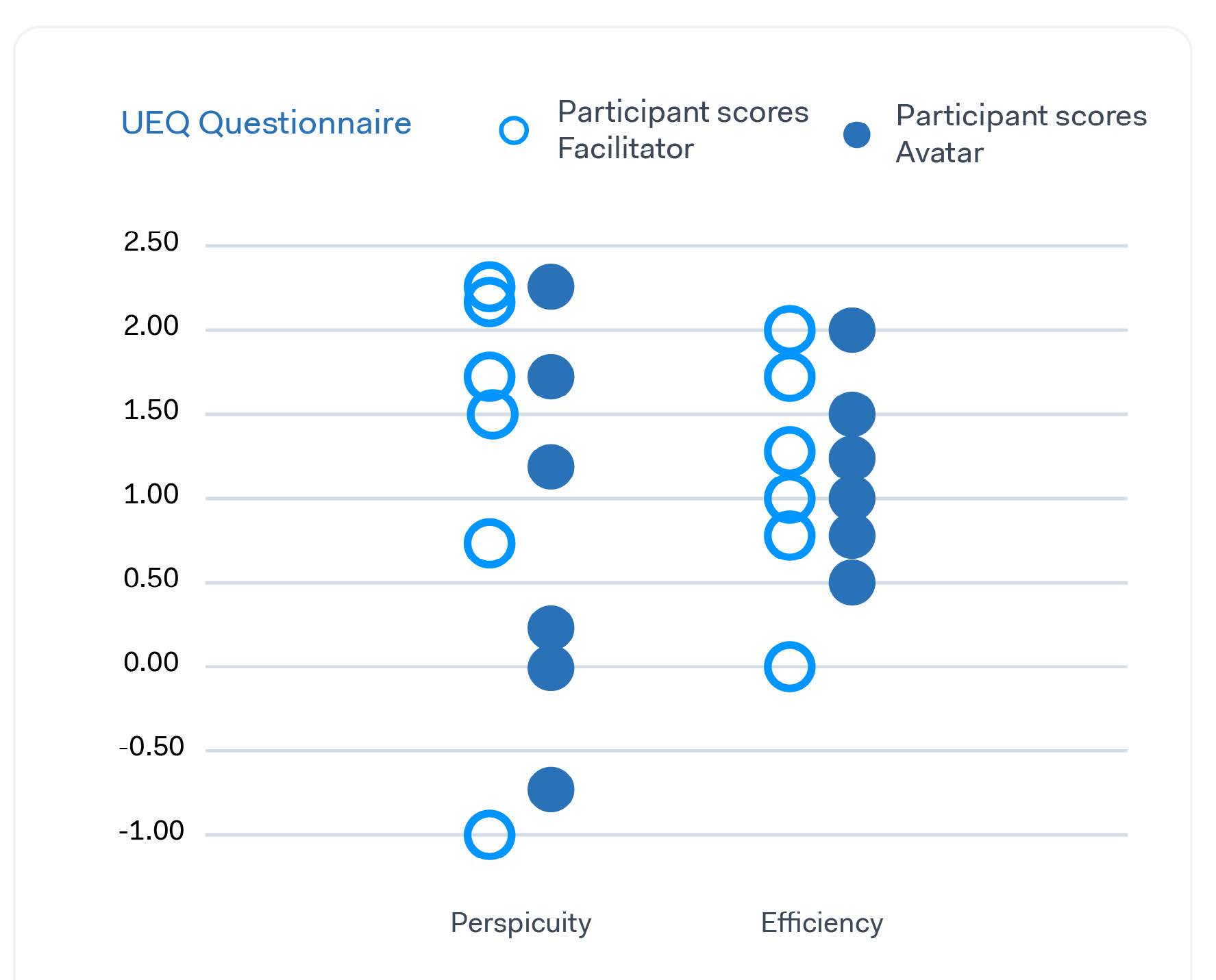
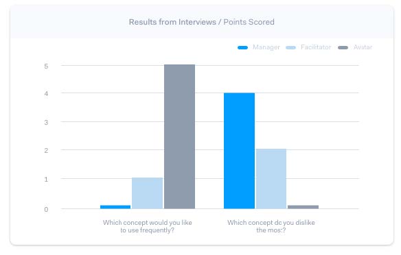
User test
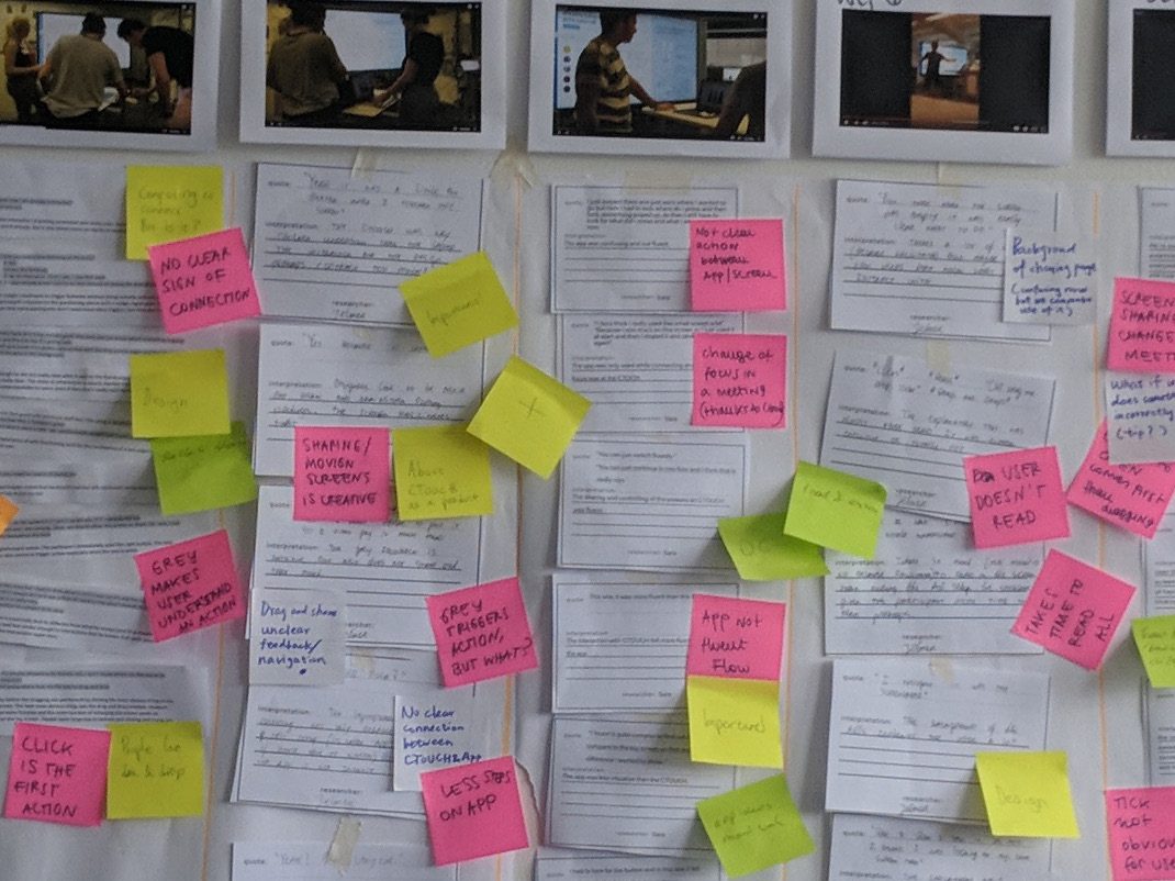
These concepts were put to the test to find, 1 what aspects of each concept work well during a meeting, 2 what is the relative quality of each concept and 3 how clear is the charter in each design to the users. In this test, we simulated a meeting with the CTOUCH using paper prototypes. During the test we observed the participants, afterwards, we interviewed them and they were asked to fill in a questionnaire.
Test analysis
The results of the observation, interview and questionnaire were then analysed. Although not every result gave a significant advantage for a single concept, we were able to use it to converge. Based on the results we converged to a single concept and combined features from different concepts into one.
UX & UI Redesign
Storyboard
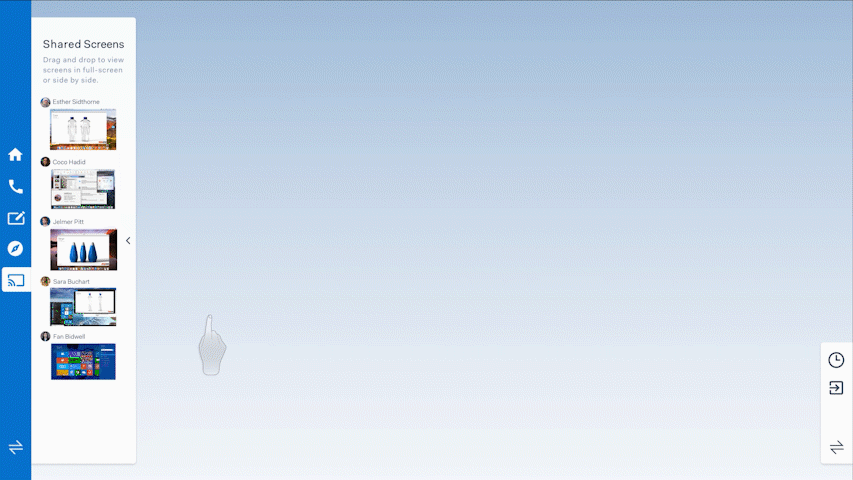
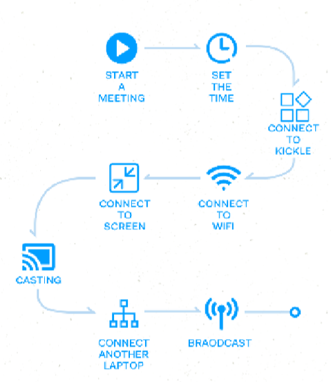
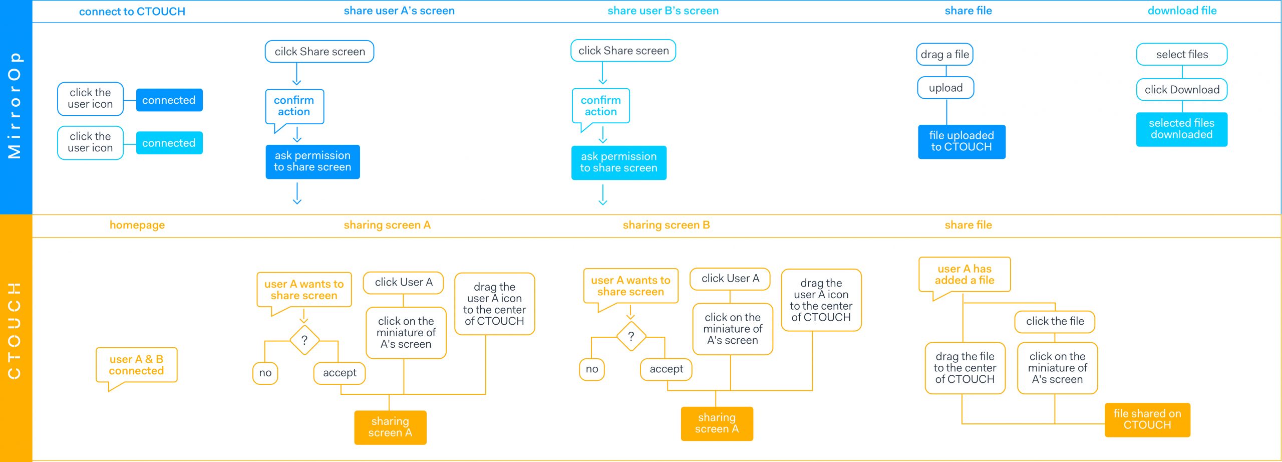
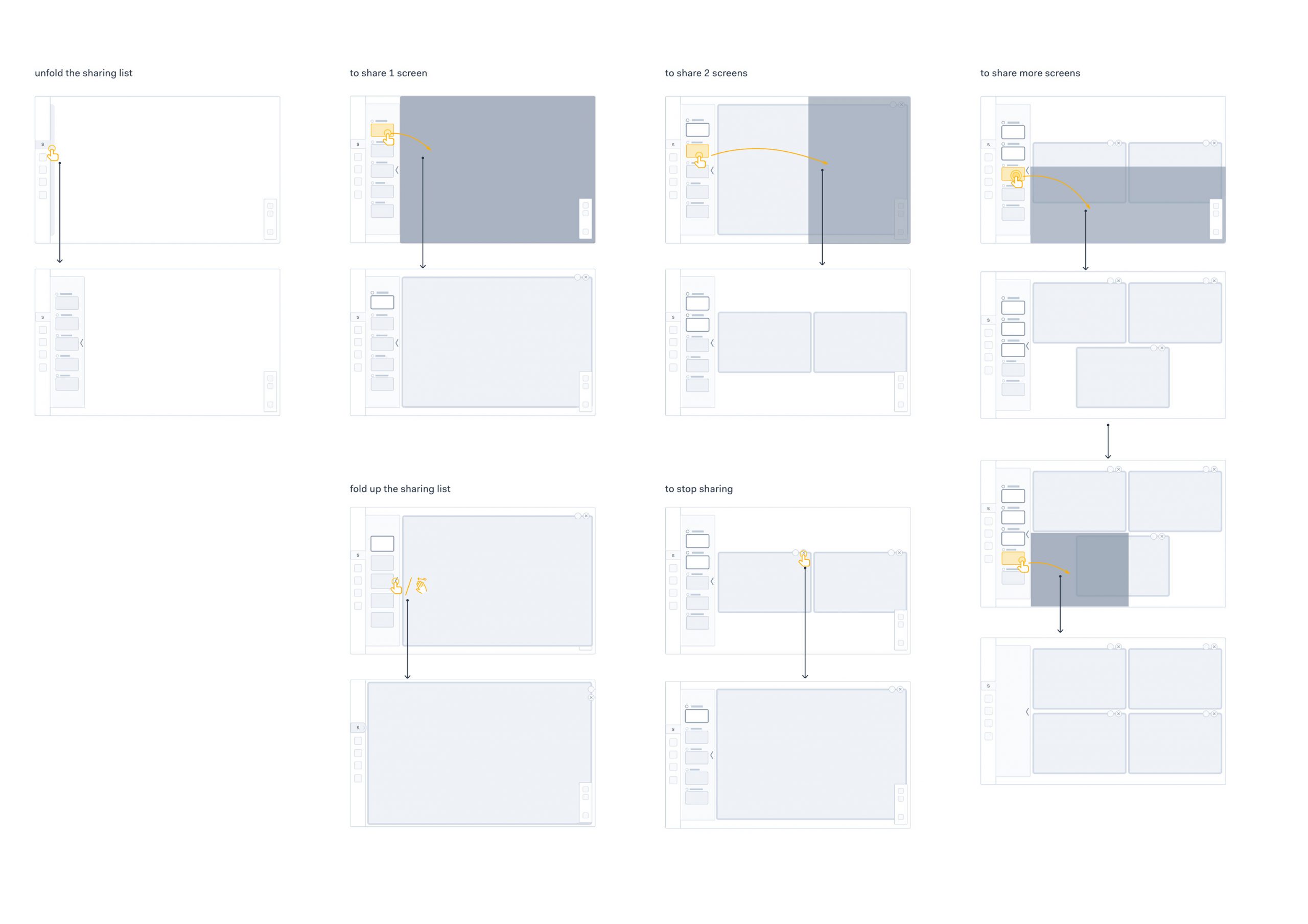
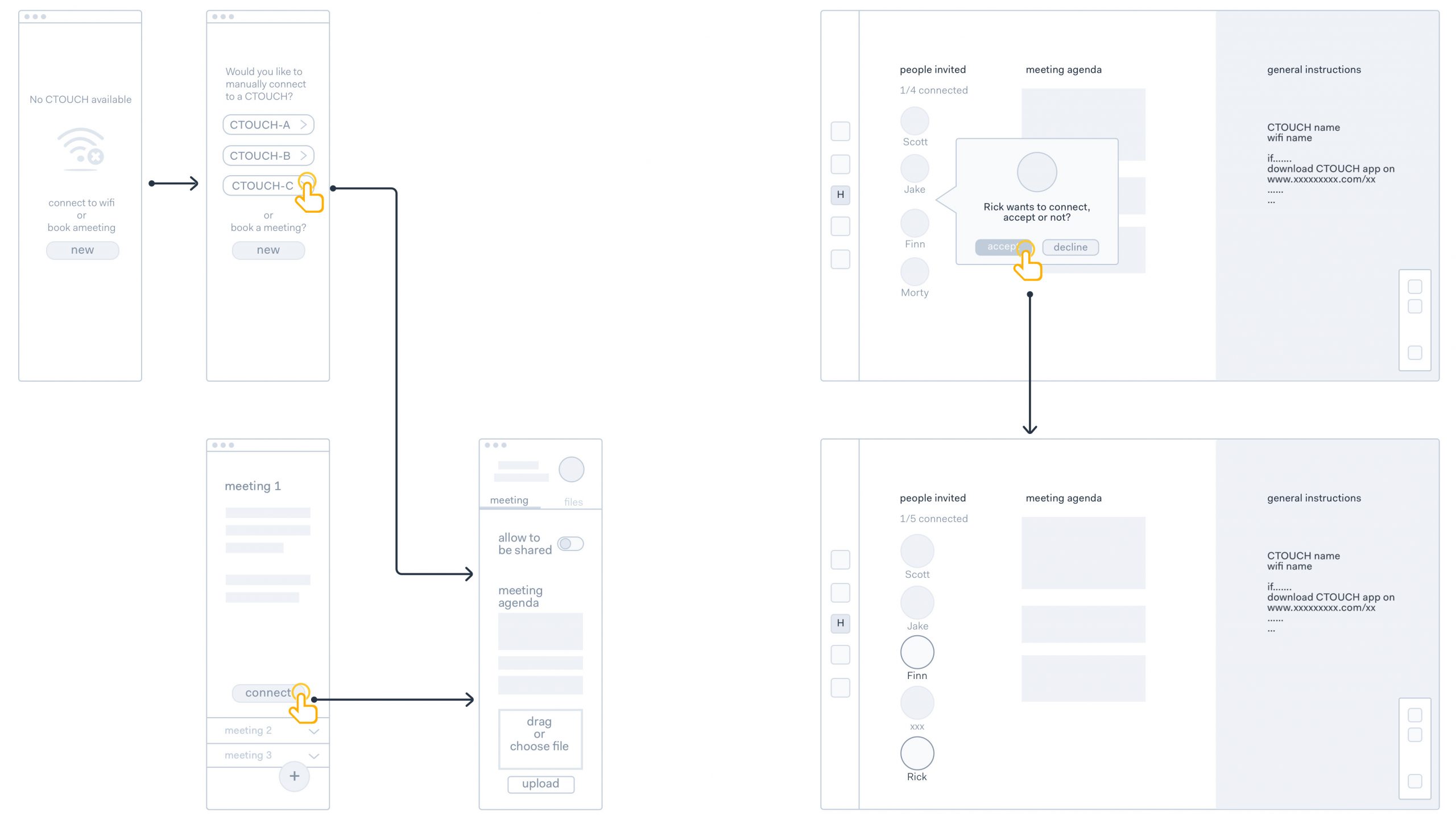
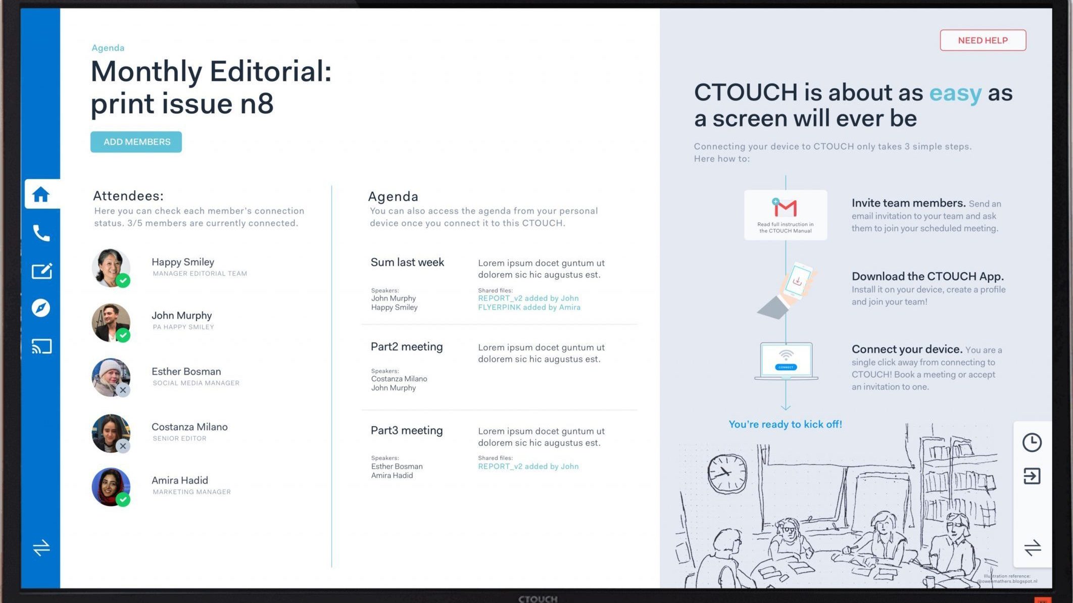
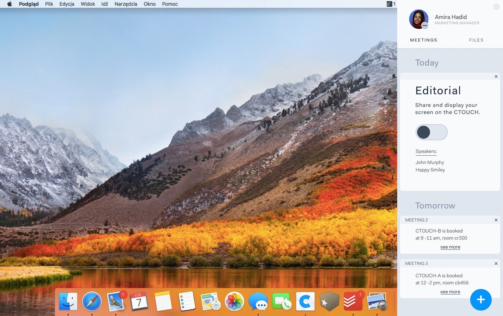
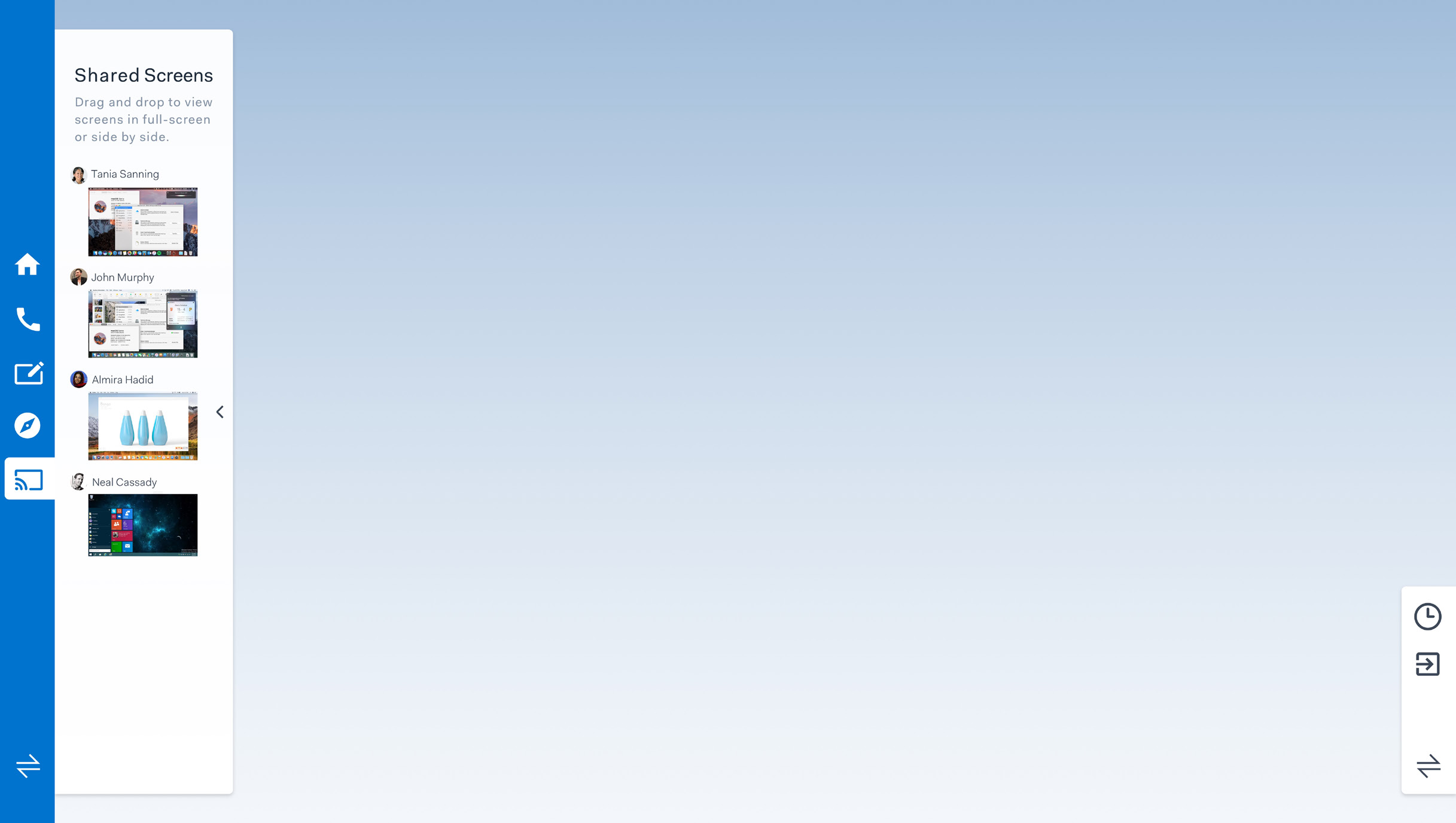
The first step towards a UX & UI was to ensure we got a clear goal to work towards. We focused on optimizing two functionalities of the CTOUCH, connecting your laptop to the screen, and sharing your and other peoples screens. To help us envision how this would look at work we sketched a storyboard of a scenario in which our version of the screen is used.
Functional design & UX
From there we first focused on the functional design UX of both the connecting to the screen and the share of screens. For each, we designed wireframes and the flow of the experience. The aim was to optimize and streamline the experience of using the CTOUCH. We also considered how the interaction should feel.
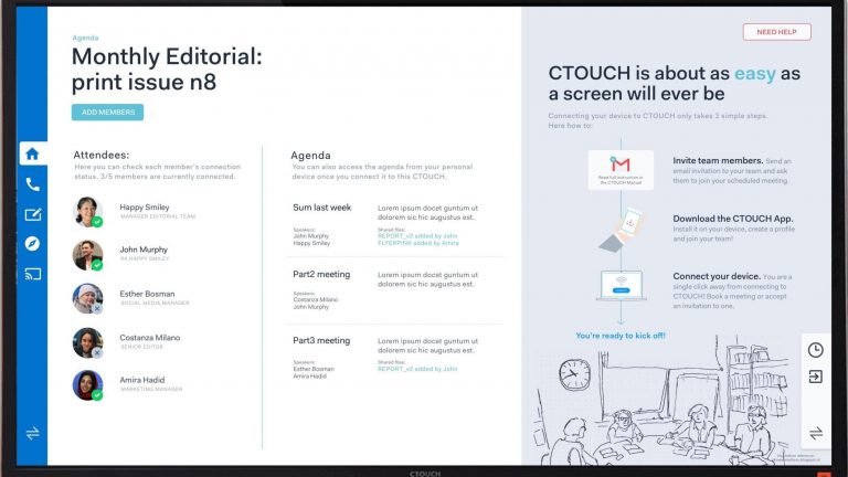
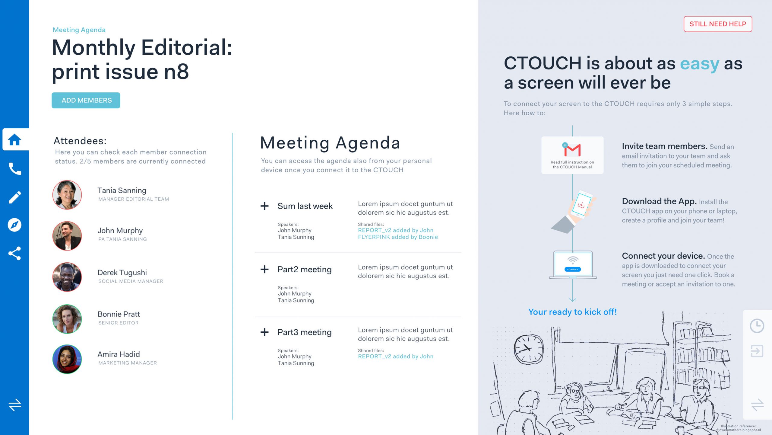
Having created the wireframes we set out to create a visual style complete our UI. To do so we looked at what kind of applications our target audience uses and used that as reference for creating our own visual style. The applications that we looked to for inspiration were, Zenefits, Slack, Mailchimp and Gusto.
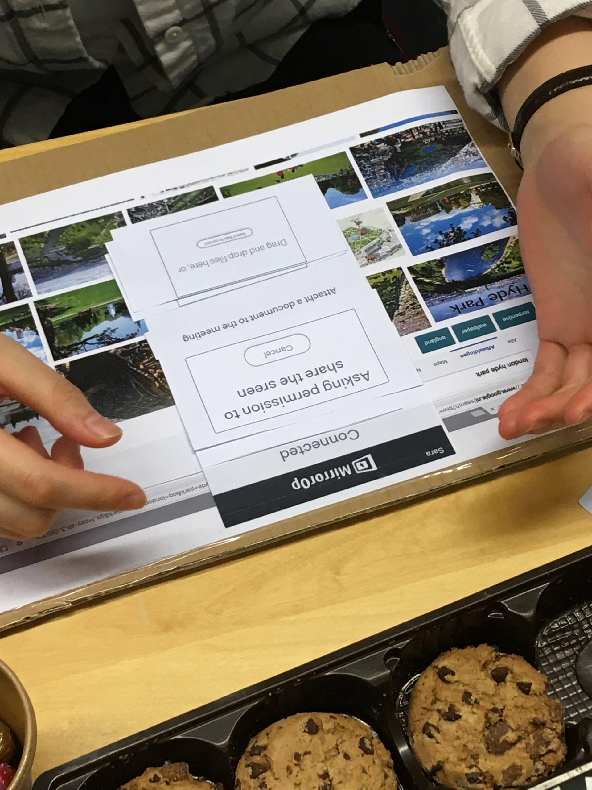
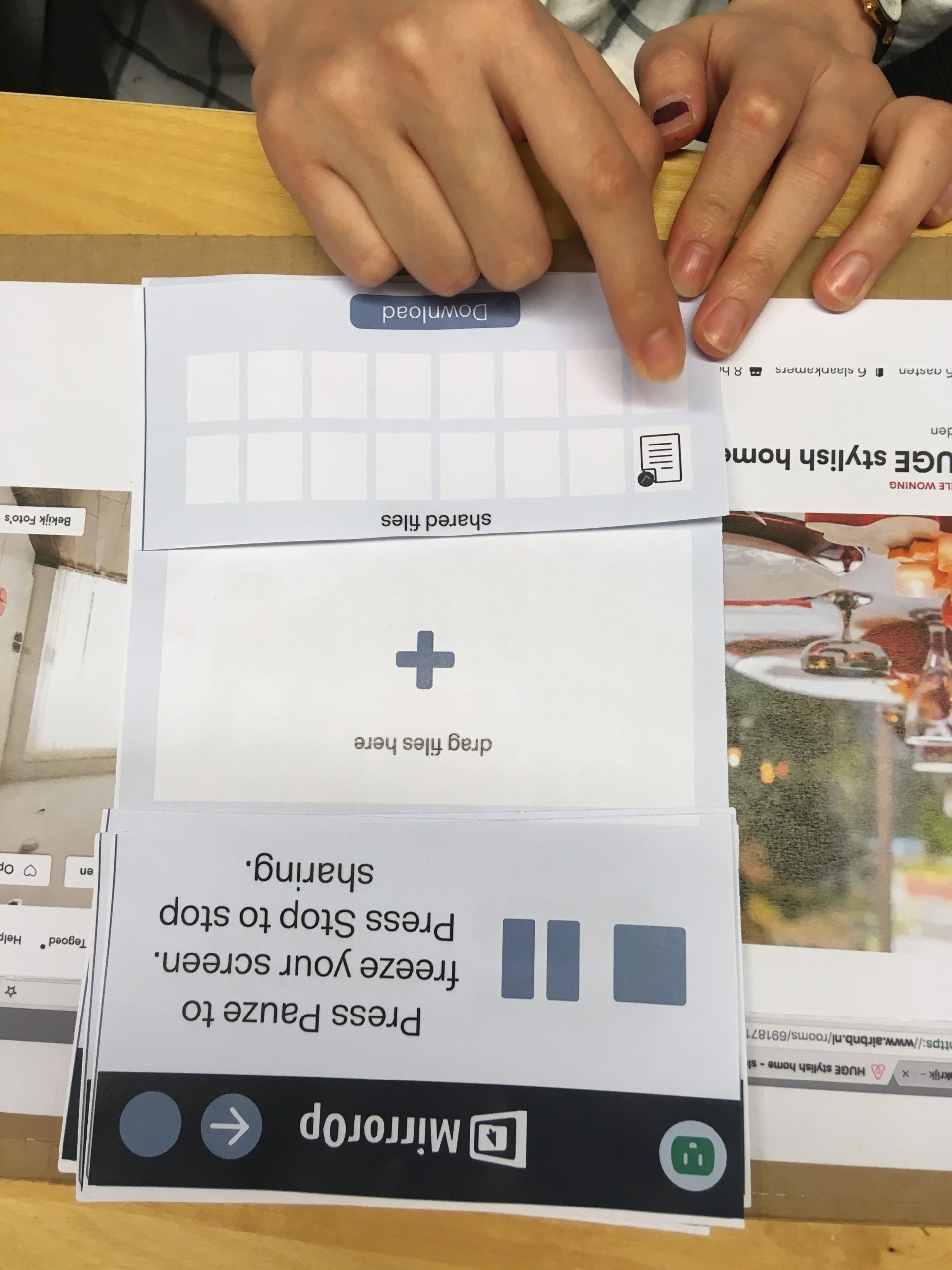
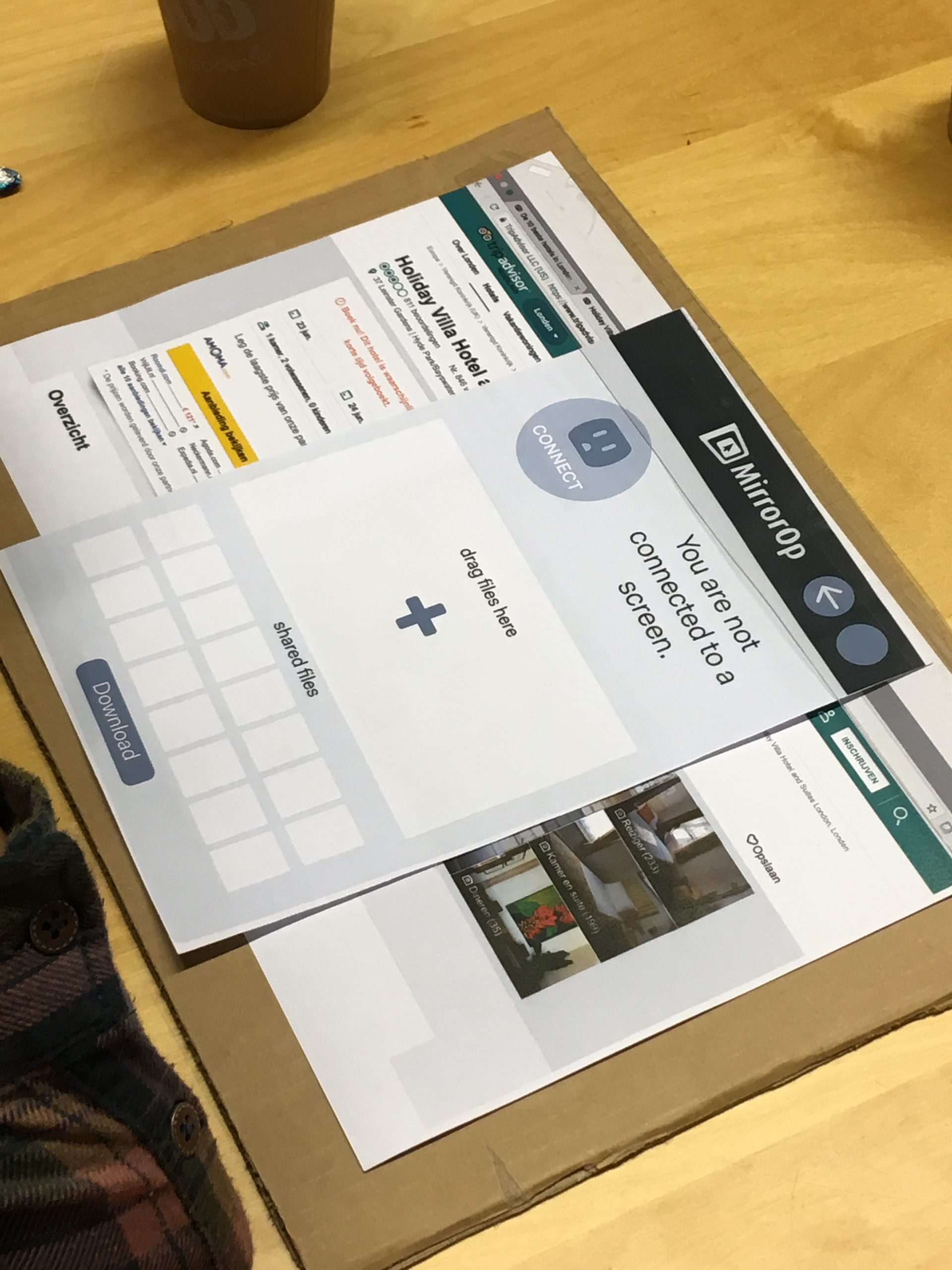
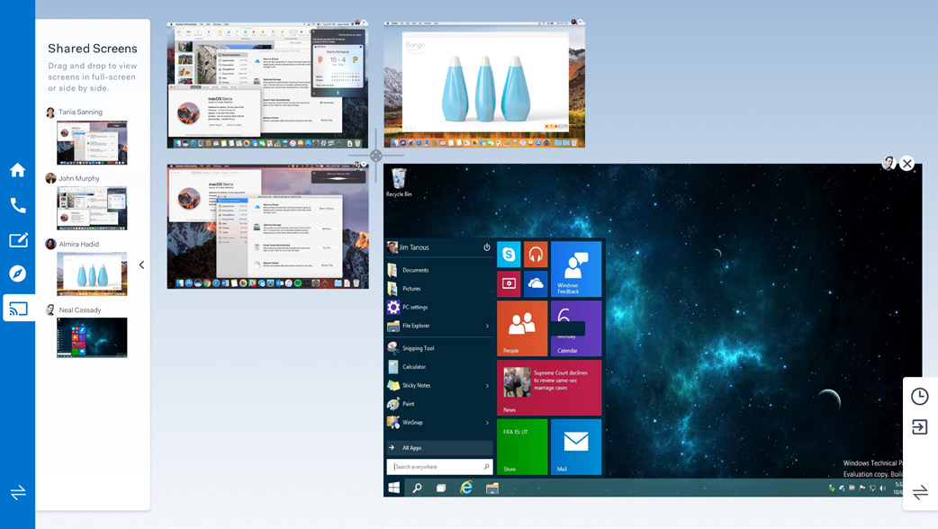
Prototype & Test Setup
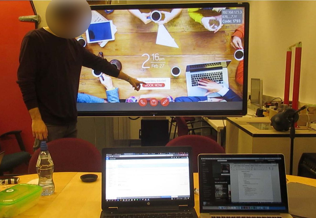
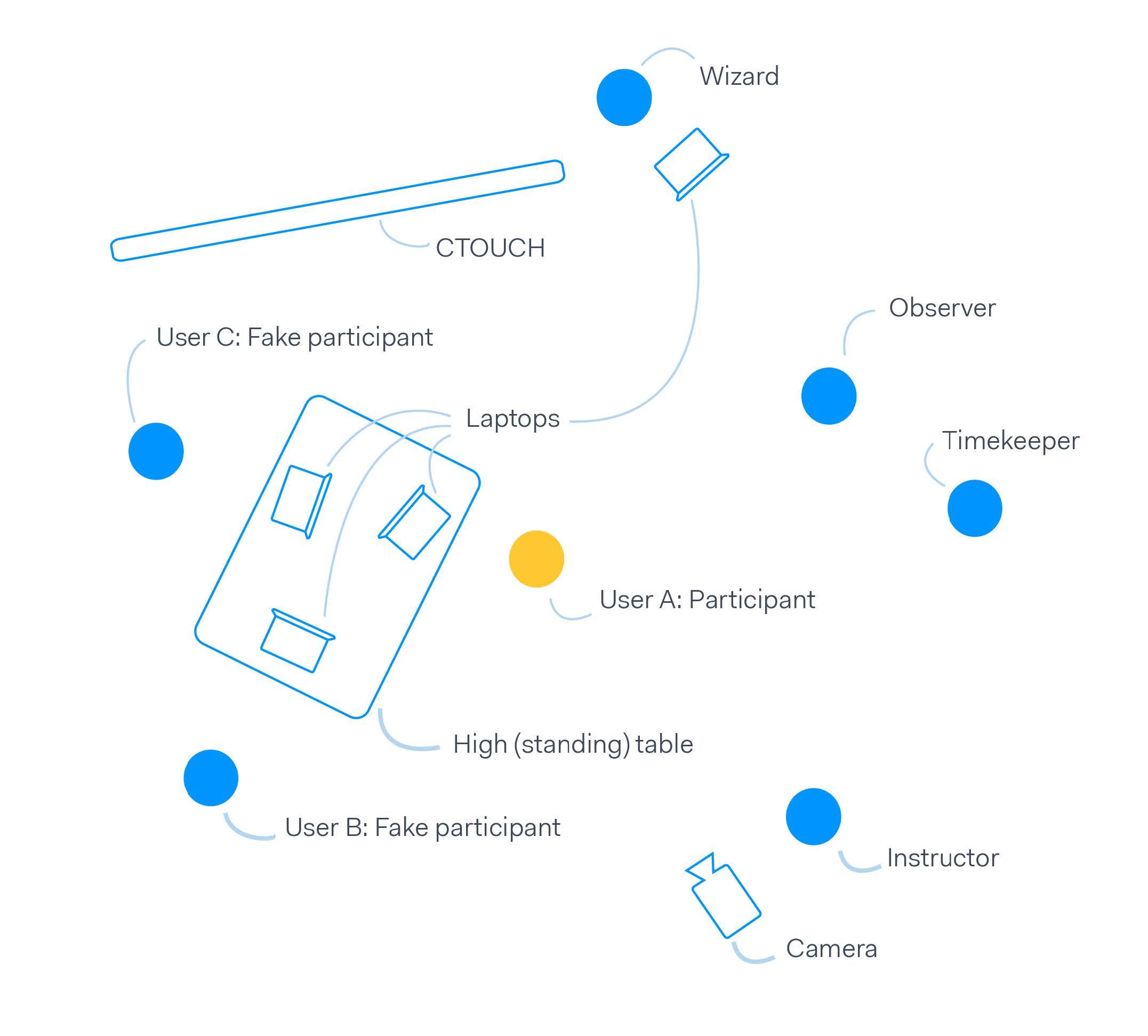
Having created a functional and visual design, we set out to create a prototype that could be used in a user test to validate our design. To create this prototype we used Framer and InVision to create a setup where the user was let to believe the program was actually working. With that, we were able to create a test setup.
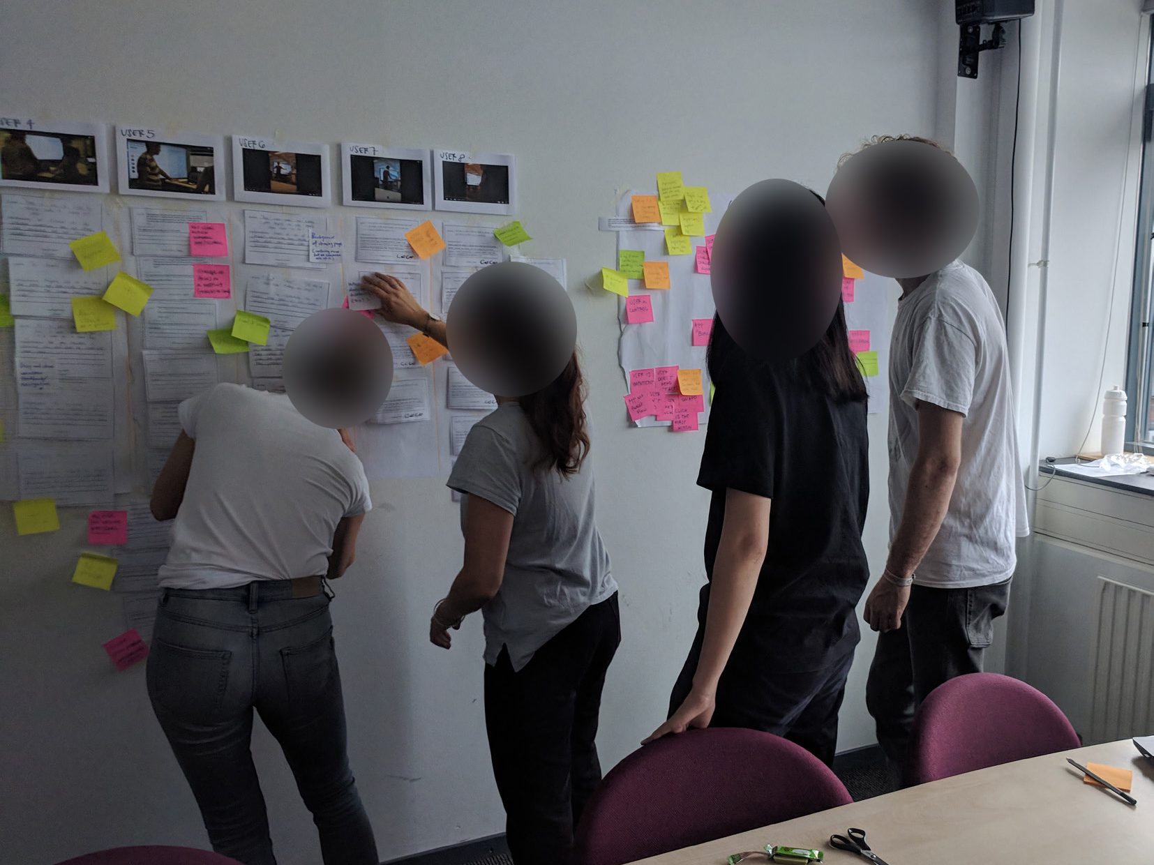
To analyse the user test we transcripted what people set during the user test. Having created a transcript we selected quotes and used an on the wall approach to make sense and find themes in all the data. Using the results we were able to see how much of the ambition we set, in the beginning, we were able to fulfil and make some final adjustments to the design.
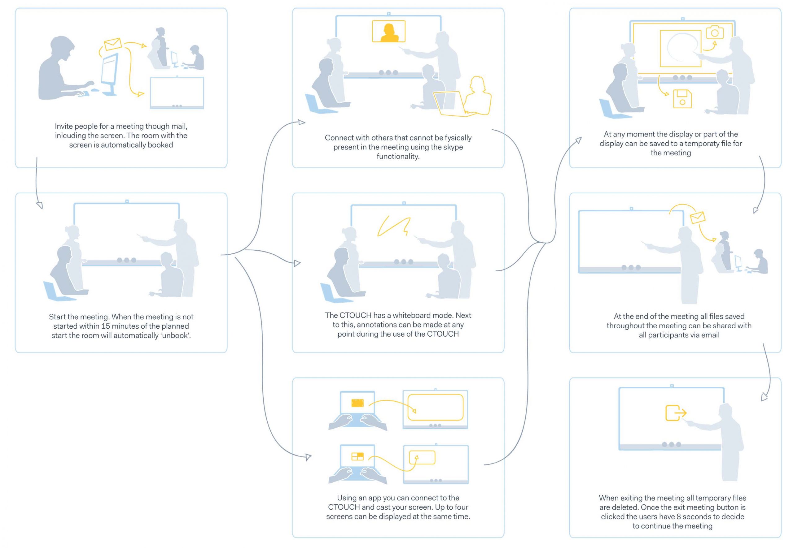
Based on the test results, we created a final iteration of the product, where we optimized the UI, UX and interaction with the product. To show the final design we created a video demonstrating our design & use case of the CTOUCH. Below are also images showing the final design.
Elective 3 2018 TU Delft Group Project AI, Data, IoT
Summary
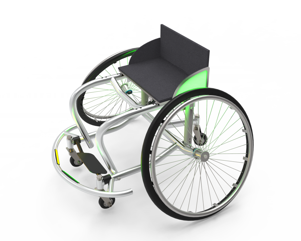
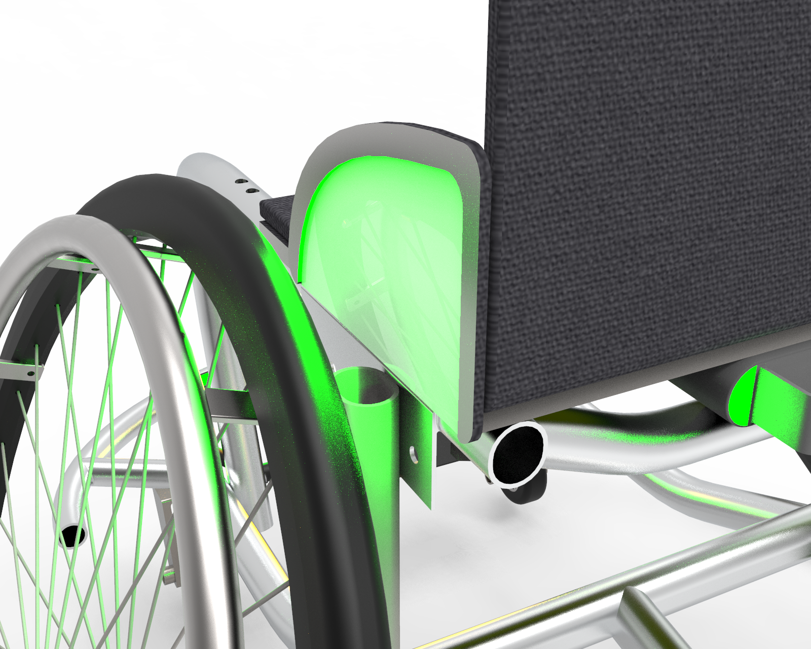
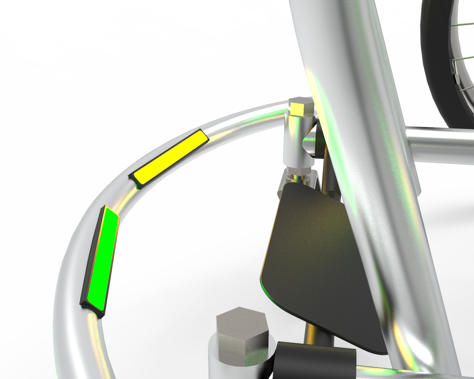
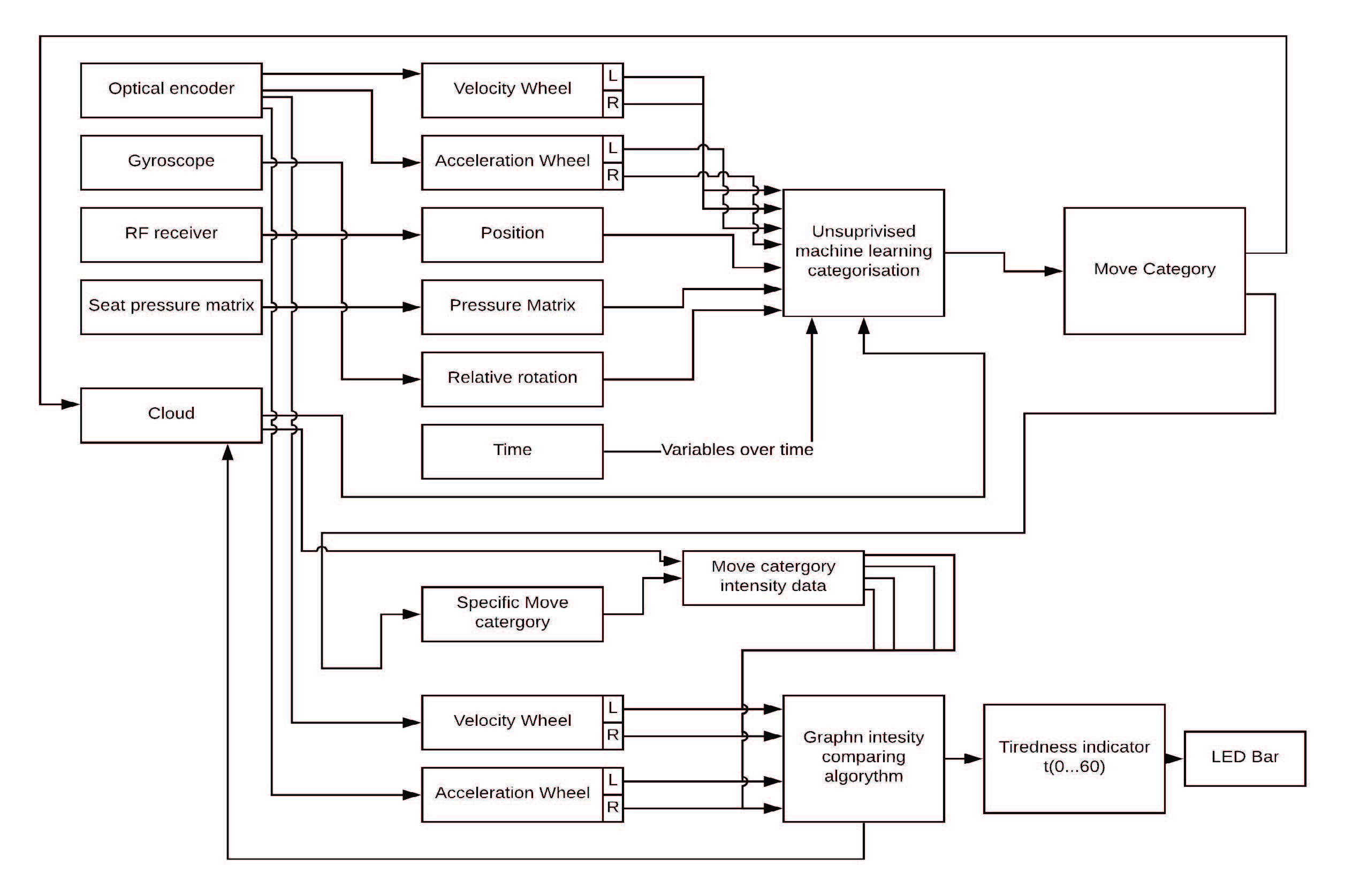
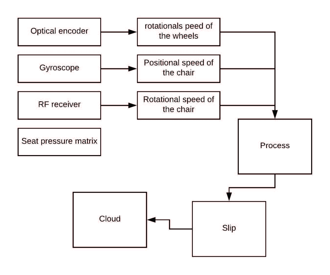
The goal of this elective was to design an IoT product and/or service system out of a wheelchair. To ensure we could design impactful features we decided to specify our target group from wheelchair users to basketball wheelchair users. From there we set out to design an IoT product that would provide both the users and the manufacturers of these wheelchairs with additional value. The final design embeds the wheelchair with 4 types of sensors, an optical encoder, a gyroscope, an RF receiver and a seat pressure matrix. These four sensors allowed us to add 3 additonal smart features to the wheelchair, iTactiX, Exhaustion Detection & Tired. iTactiX is an feature to improves players tactical play by showing them wether they should take a shot at the basket from there current possition or pass to a specific team mate. Exhaustion Detection aims to prevent injuried by measuring their exertion through a training and looking for abnomolies. Tired is a system to detect the wear and tear of the tires. It allows the manufactur to give the players buy advice when their tires are in need of replacemant and is able to offer specifc tires based on their play style.
iTactiX
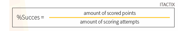
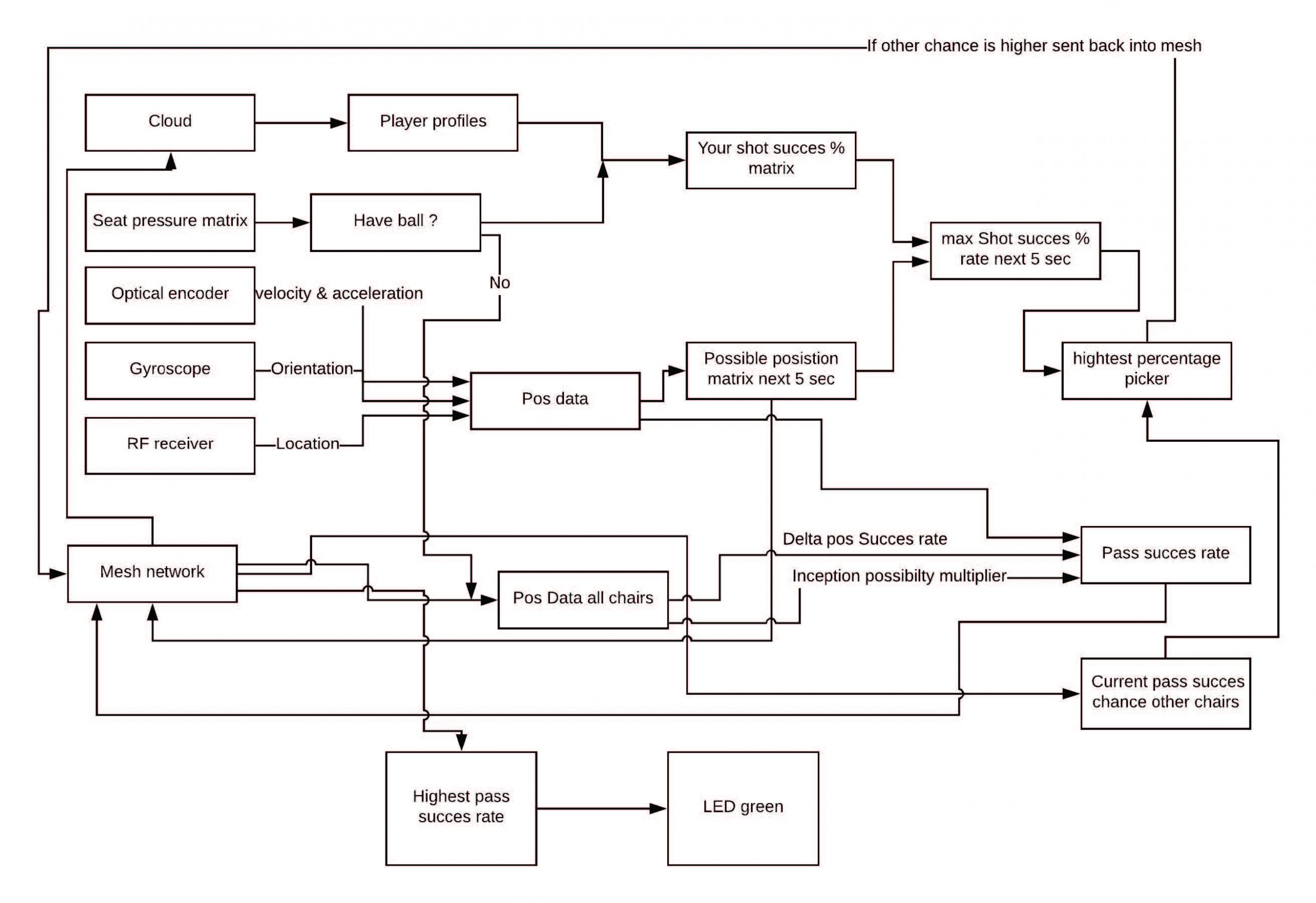
iTactix is a training feauture to help teams improve their tactical play in matches. It gives players suggestions on to who they should pass or if they should shoot on the basket. It bases these suggestion on location, orientation and acceleration data gathered throughout training and matches. This data allows the wheelchair to calculate in real time what the best option is given the players current location, orientation and velocity.
Succes formula
Technical diagram
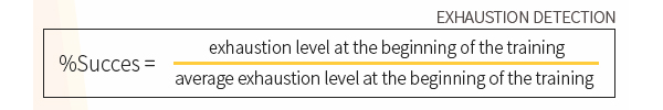
Exhaustion
Exhaustion is a feature to help prevent players injuries. It should the players how much energy they have exerted compared to how much energy they normally have. It does this by creating a profile for each player conisting of data about each training they have and the forces they exerted throughout each training.
Succes formula
Technical diagram
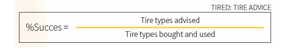
Tired
Tired is a service what offers personalized tire advice to the basketball players. It does this by gathering data on the usage of the tires and makes a profile on how a player plays. It uses this information to offer tires with different friction or profiles that would fit their playstyle better. It also is able to predict tire ware and can use this to give the players a prompt when they should buy a new set of tires.
Succes formula
Technical diagram
Final Video
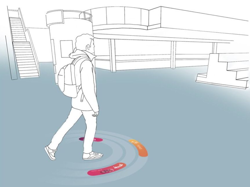
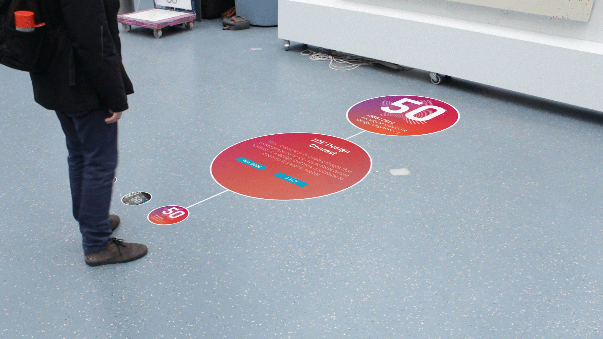
Interactive Floor
Designing for a potential future with an interactive floor
Master Elective 3 2019 TU Delft Group Project Interaction design, Interviews, Product design, Programming, Prototyping, User interface, User observations & User experience
Master Elective 3 2019 TU Delft Group Project Interaction design, Interviews, Product design, Programming, Prototyping, User interface, User observations & User experience
Summary
In this project, we were given a future scenario in which a floor could be used as an interactive display. For this scenario, we were challenged to envision an implementation of this technology in the faculty of industrial design. This meant finding useful and novel use case of this technology, designing the interface and design the interaction. This resulted in a floor that facilitates interaction and the exchange of information between collaborating students.
Process
To design an interactive floor we first determined the functionality is should have and created a storyboard of how we hypothetically would see the interaction. From there we started ideating and created two concepts. By doing user tests and detailing the functionality, style guide and the animations we converged into a final concept. This concept was then detailed by creating a video showing different interactions with the floor.
Functionality
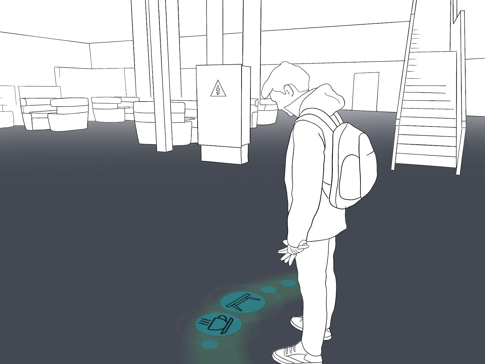
The main function of the floor is to exchange information and facilitate interaction between collaborating students. The floor will give all the information that is regularly used. It will also support group work for students who work together in the surroundings of the surfaces. Based on these functionalities a storyboard was created to envision the interaction with the product.
The scenario goes as follows: our participant enters the faculty. On the floor appears a nice, warm message. Right after, a schedule appears, indicating that he has a few minutes left as not all his group members have arrived yet. He takes this opportunity to get some coffee. He then proceeds to his group member. The floor shows him exactly where to go, saving him time. Most part of the day is spent on working on a group project. After a few hours, the floor indicated that he has been working for a while and it encourages him to take a break. After the break, he and his group member decide to show each other what they have done using the floor. Then it’s finally time to go home. With all this extra help, he and his group member have had a productive day.
Conceptualisation
Based on the storyboard and functionality we created individual ideas and sketched. These were merged into two concepts, concept fluid and concept compass.
Concept Fluid
Concept fluid is mainly inspired by natural elements such as water, as such the animations and movements aim to be fluid.
Concept Compass
Concept compass aims to be more structured and uses geometrical shapes and parts of geometrical shapes.
User tests
User tests were executed to see how people would respond to ideas from the concepts. They were also used to validate and iterate on the size of different elements of the interface.
Based on the users test the functionality of the product was further defined and developed. The types of animations and interactions were also explored
Final concept
Based on the findings from the user tests and the exploration, a final concept was designed. In this concept, every user has a personal avatar. This avatar is their companion and can assist them with whatever they need.
Testing the interaction
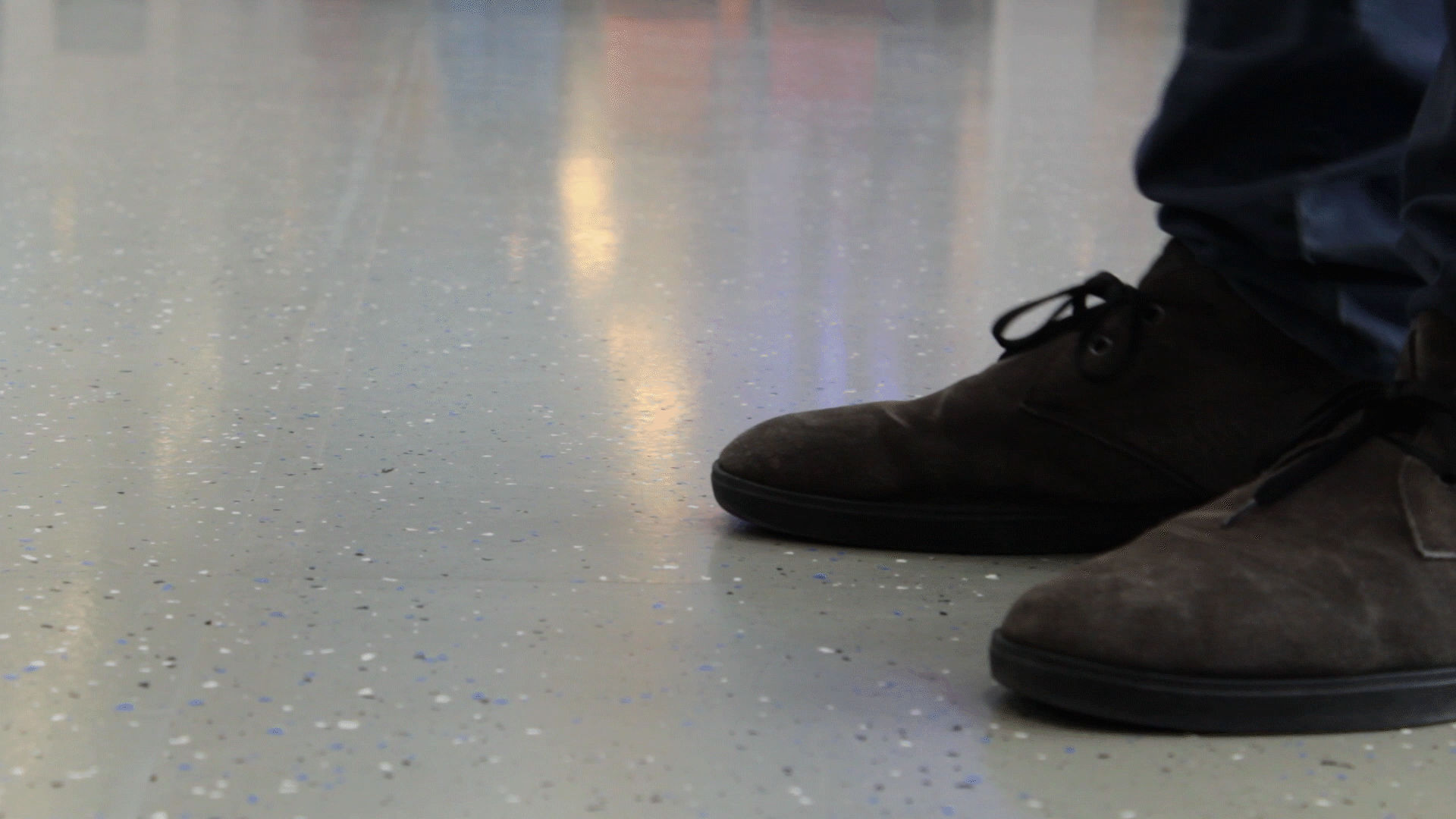
After the design was done, the interaction with it was tested and validated. This was done by projecting the animations on the floor using a beamer. Together with the participants we walked through the interactions and asked them for feedback. Using their feedback we were able to iterate upon the design and fine-tune the interactions. From there the design was finalised and put into a video, presenting the whole concept and the interaction with the concept.
Elective 3 2019 TU Delft Group Project Design fiction, Interaction design, Interviews, Product design, Prototyping, User observations & UX
Summary
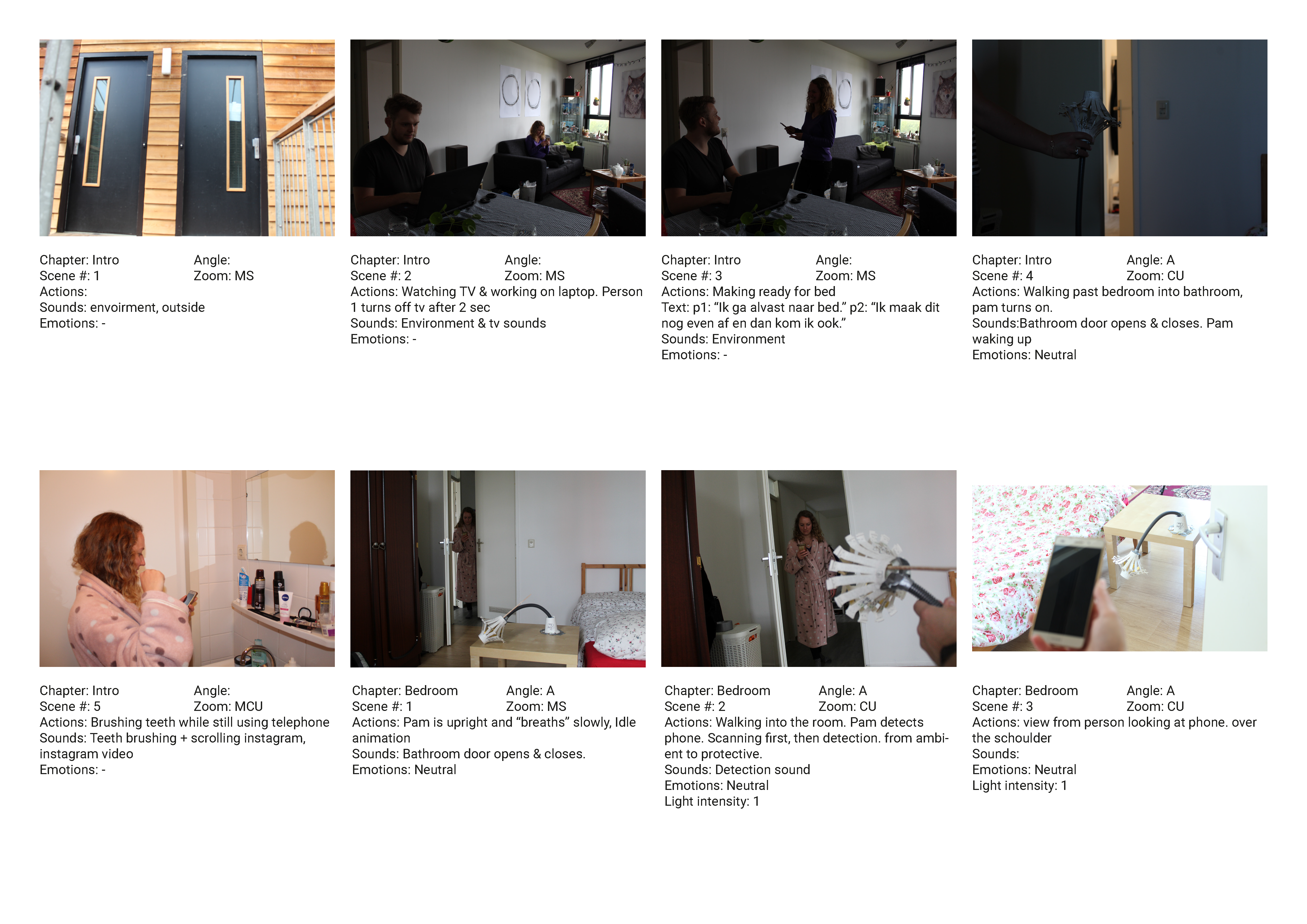
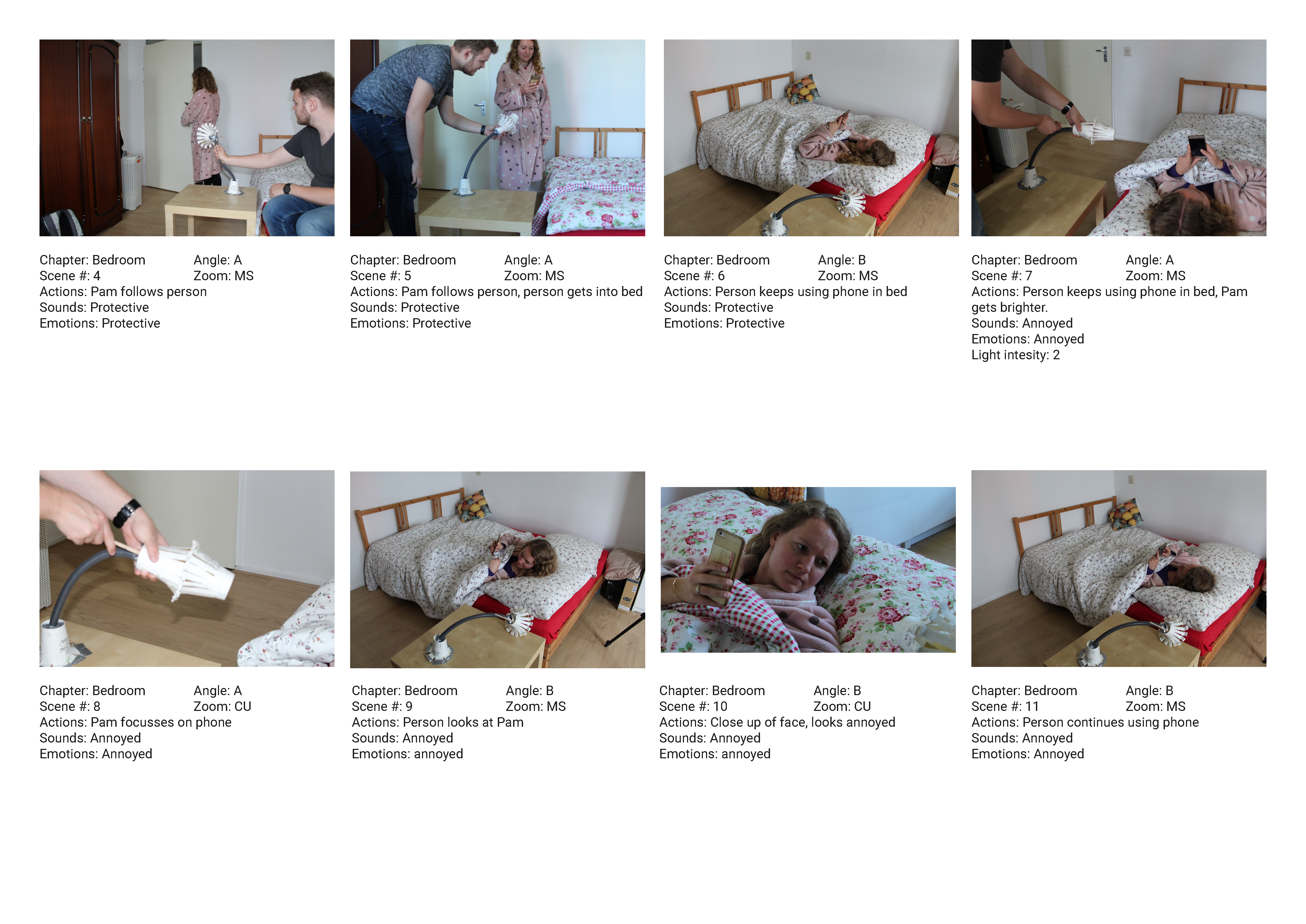
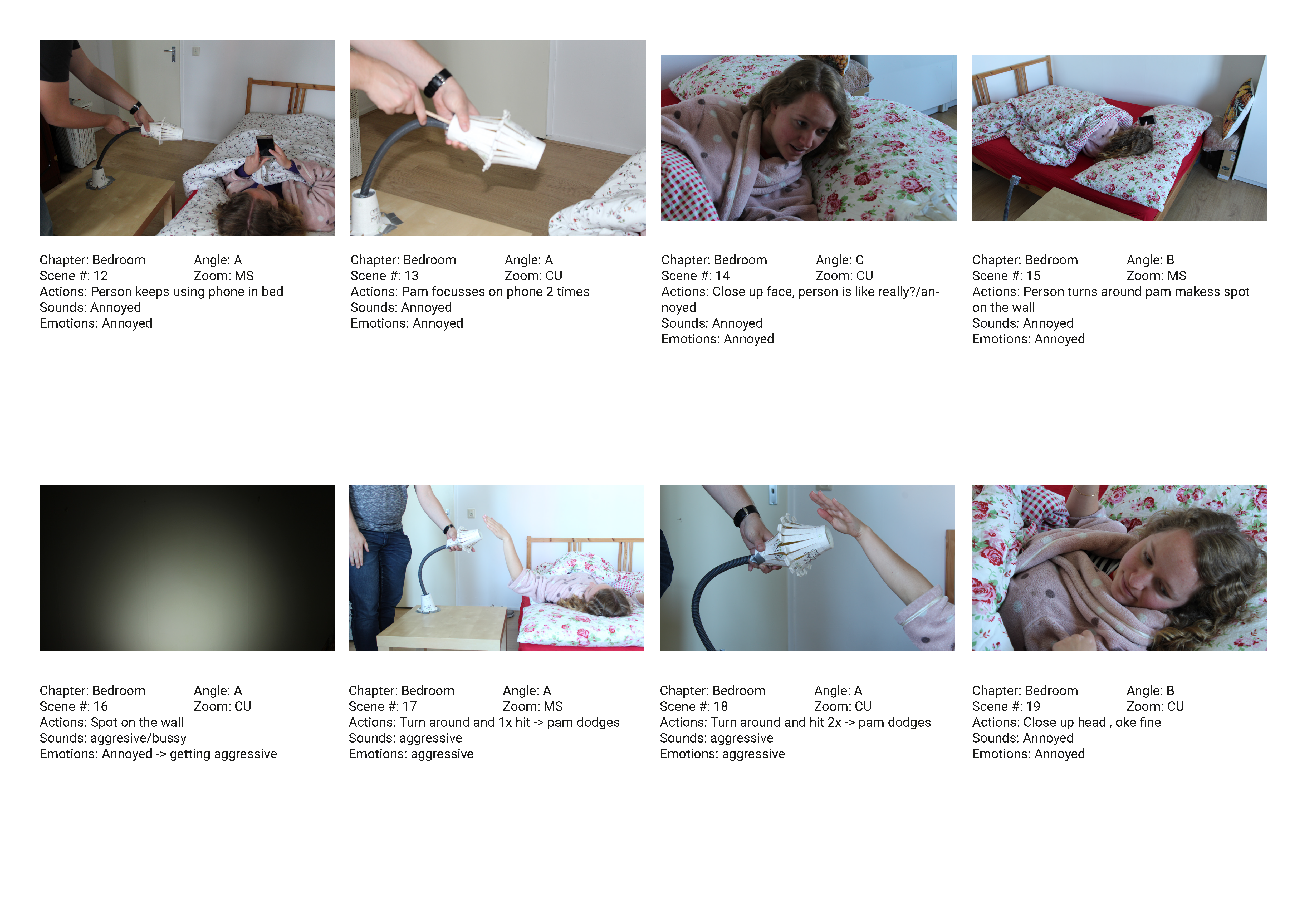
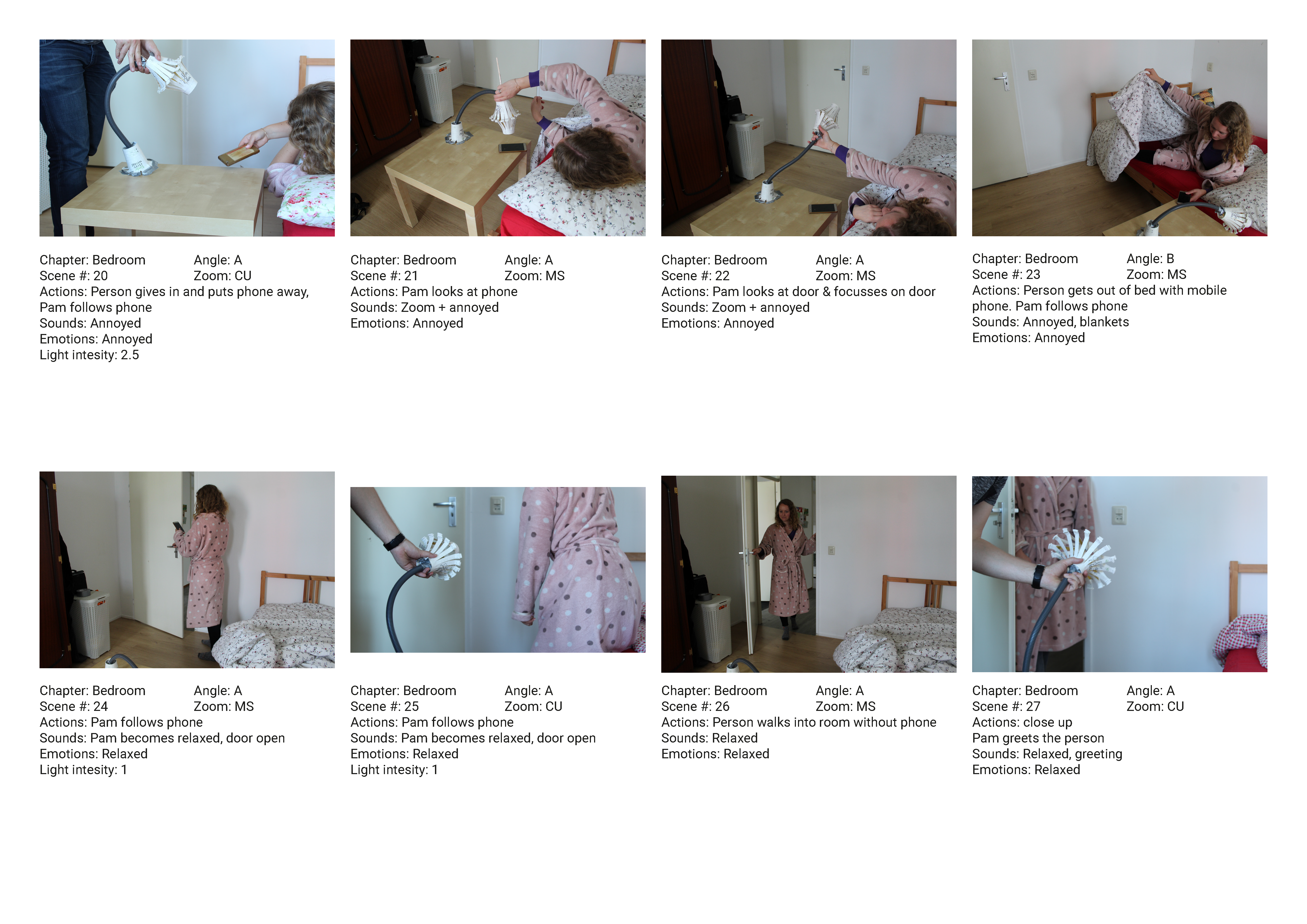
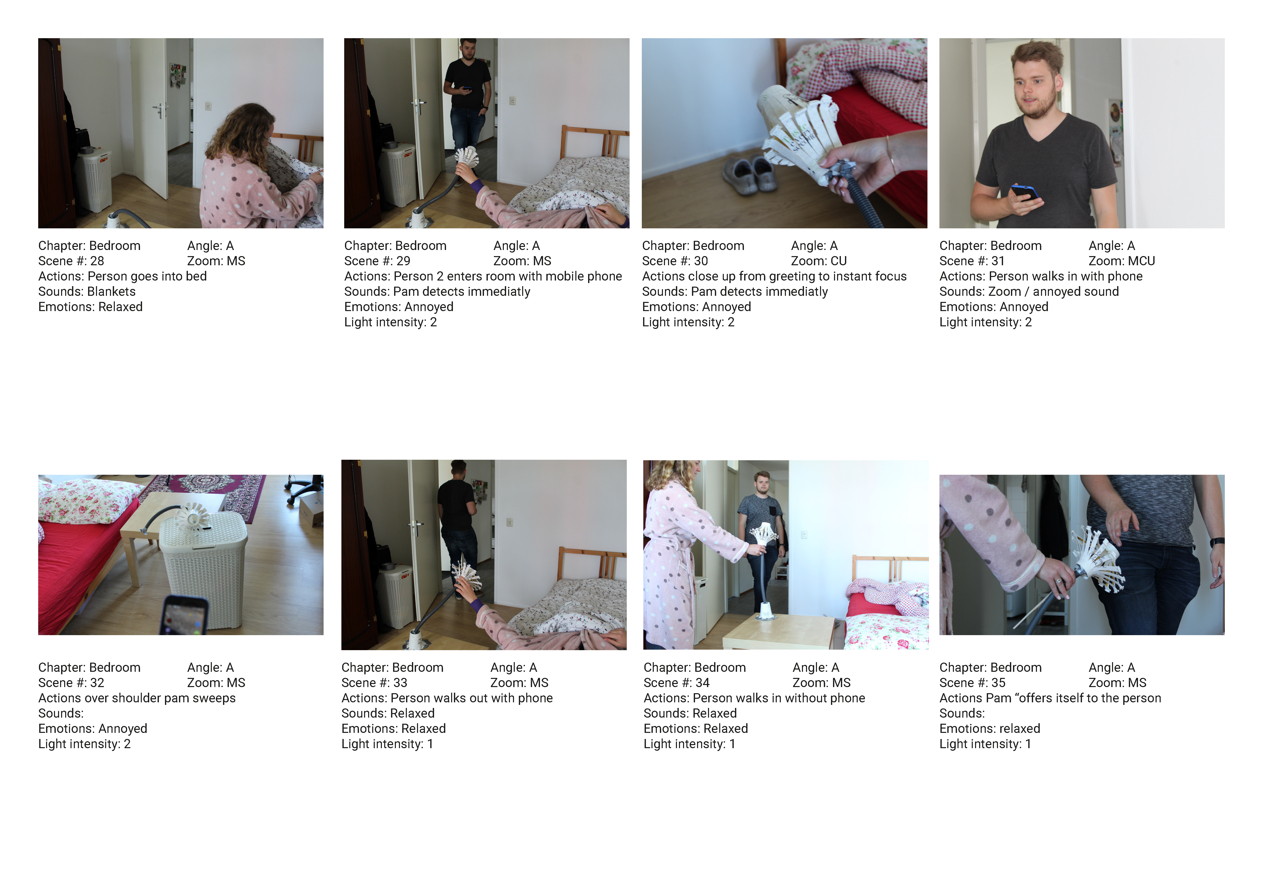
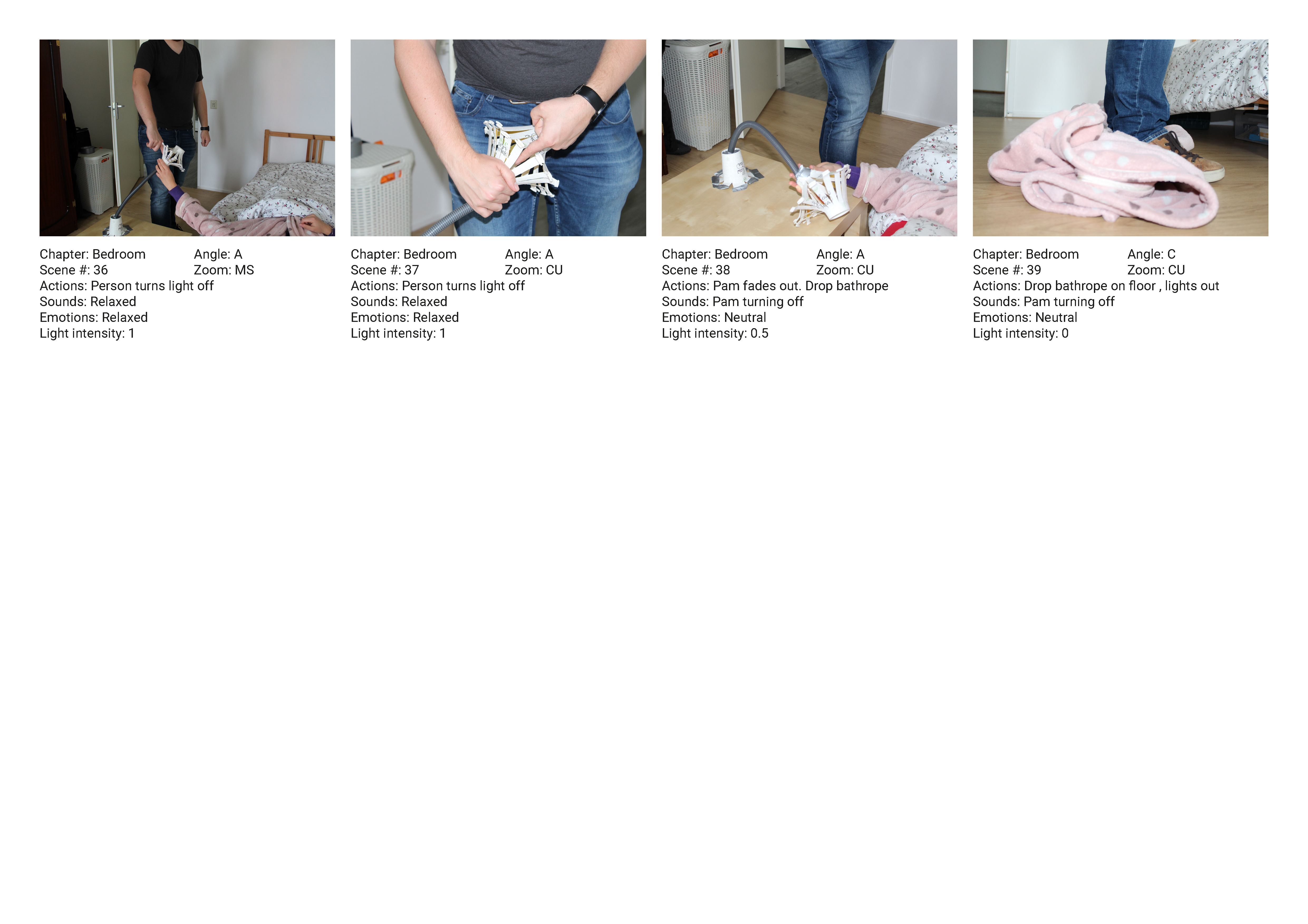
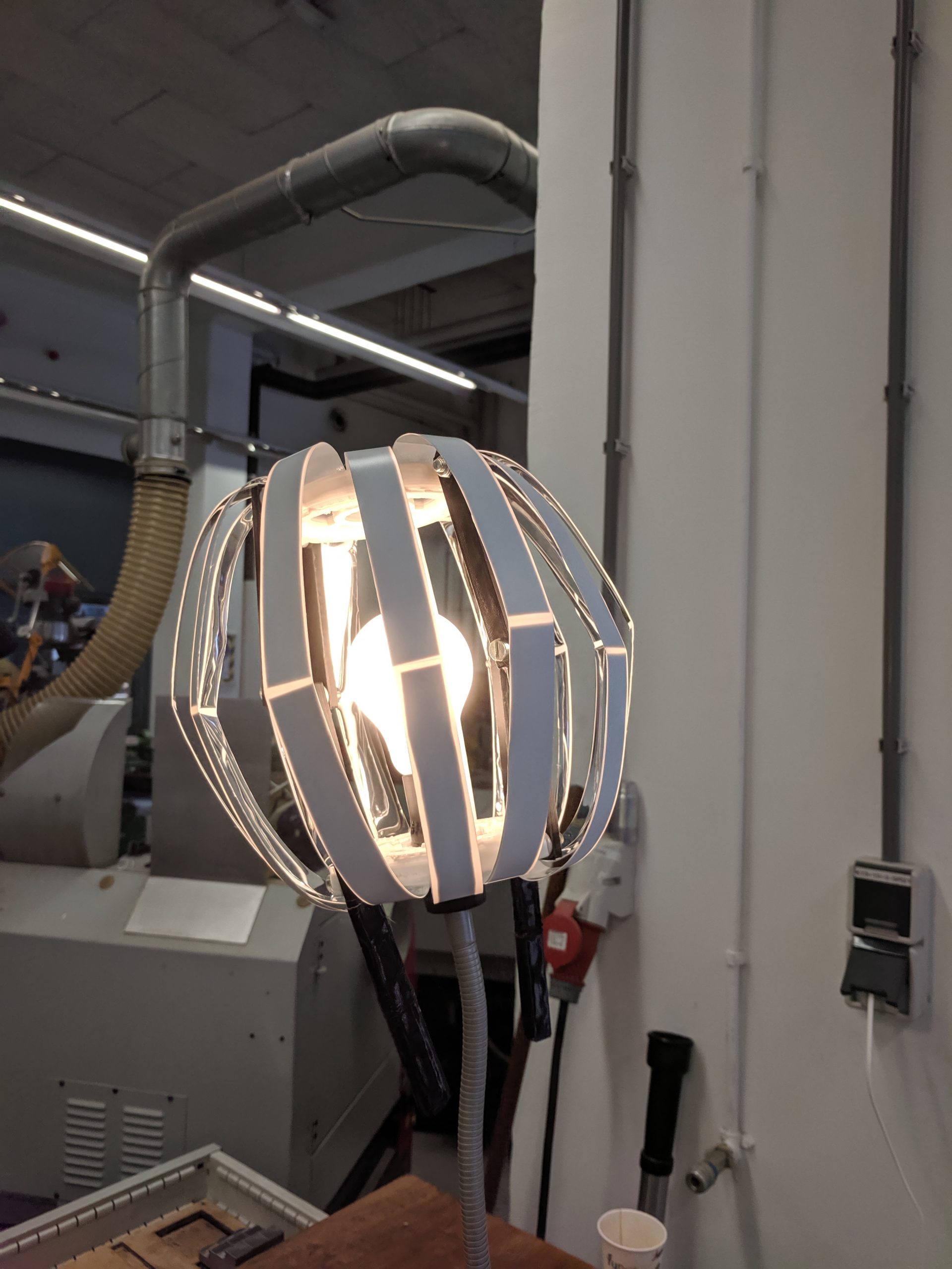
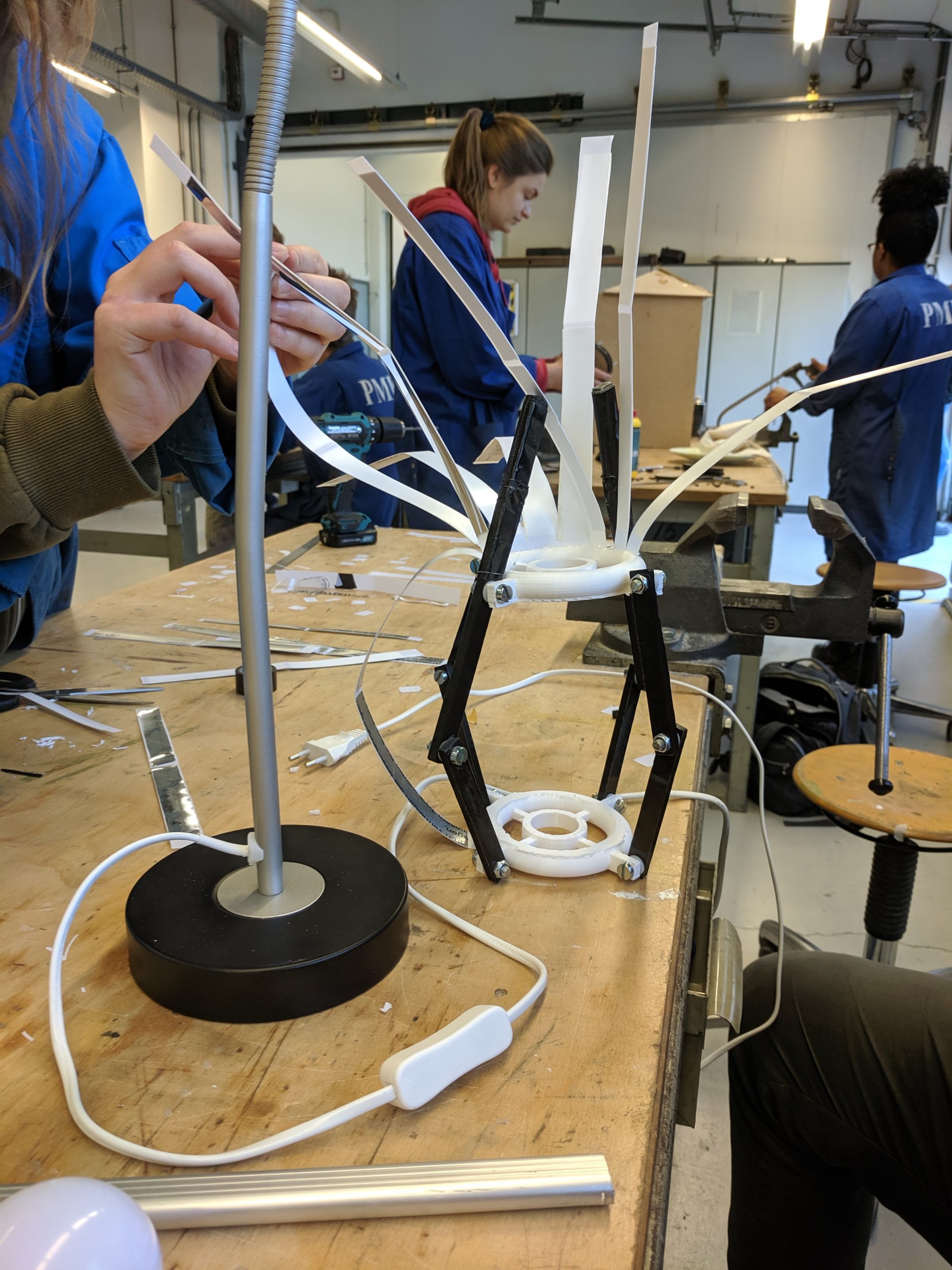
For the course, “interactive formgiving”, the assignment was to design an Object with Intent (OwI) through user research, prototyping and design fiction. OwI is a new perspective on smart objects (Rozendaal, Boon, & Kaptelinin, 2019). They are everyday objects that act as collaborative partners in human activity. The product we designed is an interactive bedside lamp that helps with smartphone usage at bedtime. This lamp does not tolerate the usage of a smartphone in bed and goes from being annoyed to aggressive and annoying.
Process
To design an OwI we utilised video and WoZ prototyping. This allowed us to create quick prototypes and test, enact and specify behaviour. This allowed us to design and intelligent product without having to actually program and create it. This process consisted of creating a first version of the product, testing it, and using the results to itterate and create a final video.
Concept
To design this we first decided on a product and context. A bedside lamp that helps you with phone usage in bed. From there we looked at what behaviour characteristics the product should have. For this, we went with an overprotective girlfriend that is also demanding and aggressive. Based on these characteristics a storyboard, behaviour flow and an early prototype were created. This behaviour was then sketched out in a video.
Early prototype
This prototype was then used in a wizard of oz (WoZ) style user test. In this test, we enacted the behaviour of the product to see how users responded and find what kind of behaviour is desired. During this test, there was a dialogue between the users and the designers. During this, we went into specifics with regards to the behaviour and how the behaviour felt.
Based on the feedback from the users we iterated on the prototype and its behaviour. The behaviour was finetuned by creating a video of a scenario in which the object enacts its behaviour. Through the creation of the video, the behaviour became concrete and detailed. Sound effects were also added as an additional layer to further communicate and solidify the character of the bedside lamp.


