Master Course 9 2018 CTOUCH Group Project Desk research, Interviews, Product design, Prototyping, UI, User journey, User observations, User testing & UX
Summary
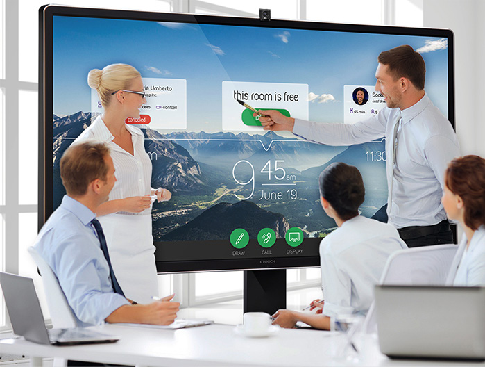
For this course, Usability and User eXperience Assessment in Design, we were asked to redesign the CTOUCH Leddura 2Meet. The CTOUCH is a big screen that is supported by an app. It is designed to be used in a business meeting, performing as a multifunctional big screen. The focus of the project was to improve “tagless teamwork” with the CTOUCH: the event of showing multiple other devices’ screens on the CTOUCH at the same time, and the focus issues that this brings along in a business meeting. To improve the tagless teamwork we first analysed the current product, then we did two rounds of creating a redesign and testing it. Finally, we implemented the results and created a final design of the interface and experience of the CTOUCH screen.
Process
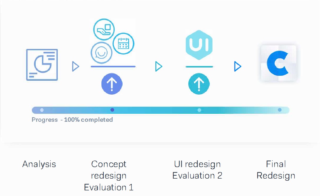
The process of redesigning the CTOUCH consisted of four parts. First, we analysed the current screen and its usage. Then we did a round of redesigning and testing of the screen focussing on the identity and tone of the design. The second round of design and testing focussed on UI and interaction. Afterwards, all the results from the tests were processed and a final design was created.
Analysis
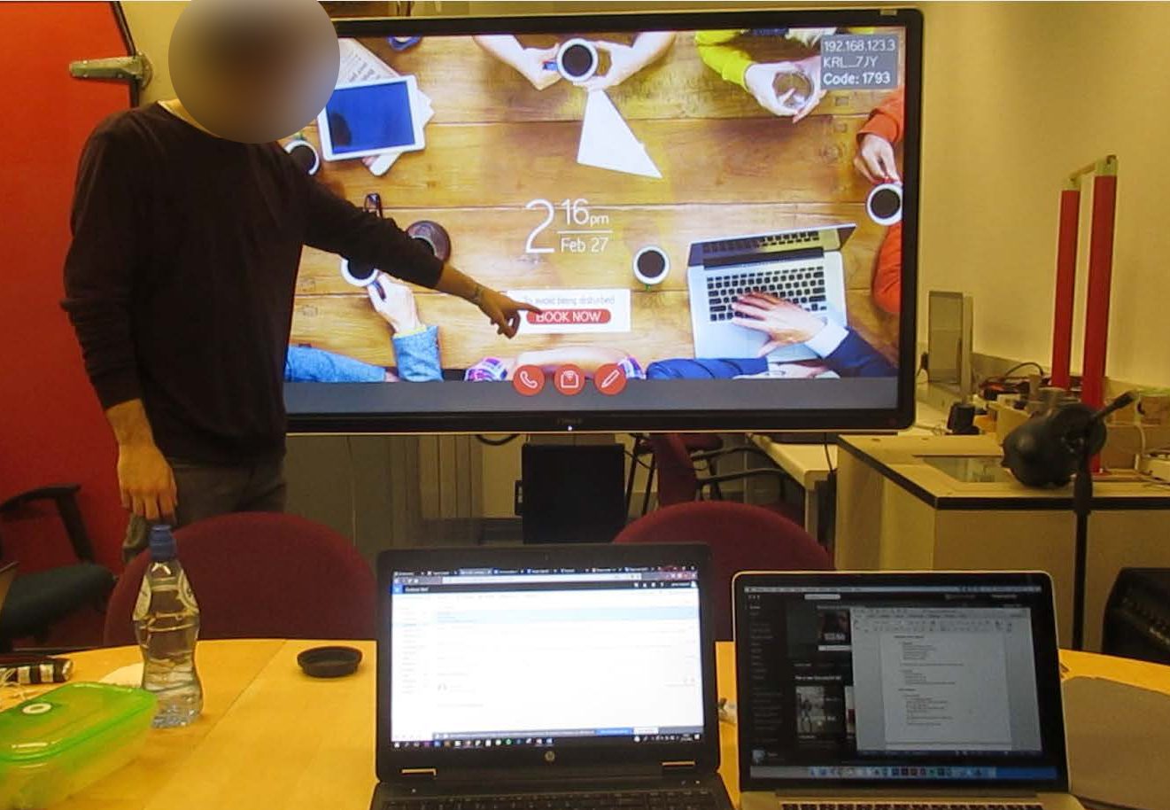
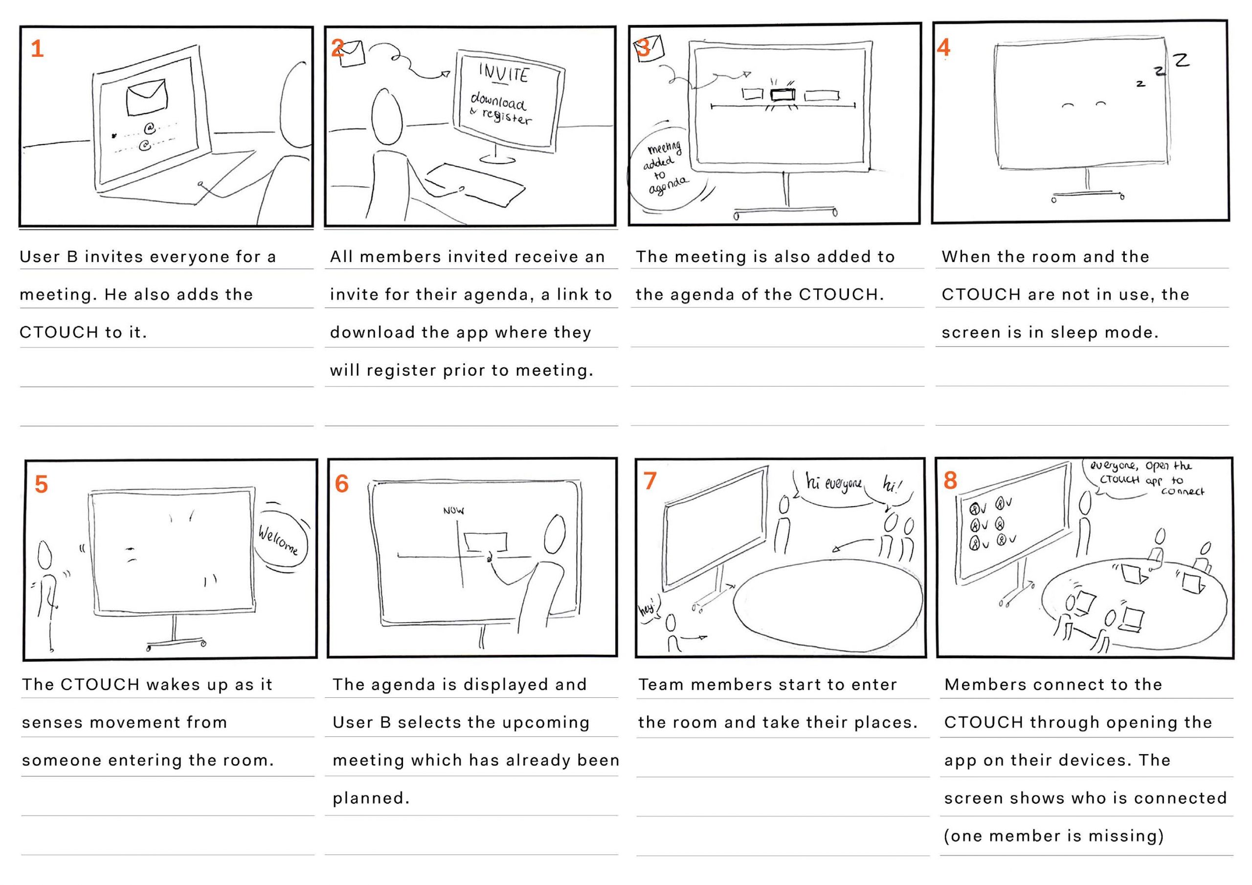
Leddura 2Meet as it's currently being used
The first step towards redesigning the CTOUCH was to analysis the current product and its context. The goals were to find areas where the product could be improved and what should be kept the same.
Current Usage
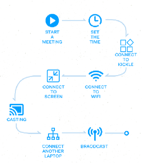
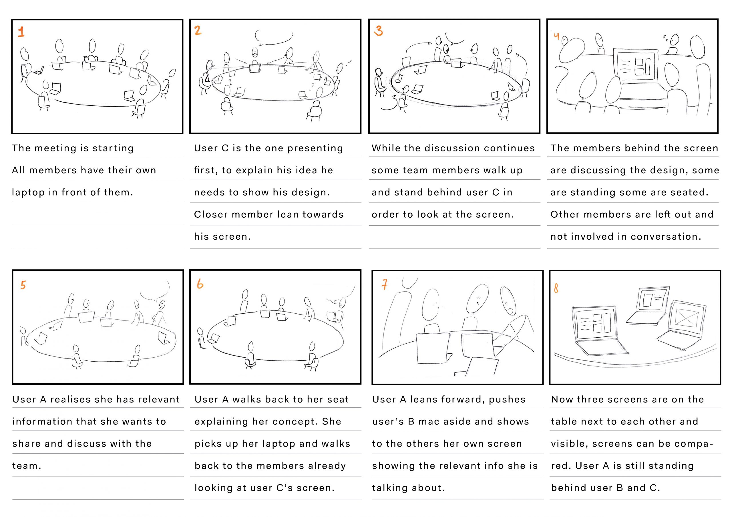
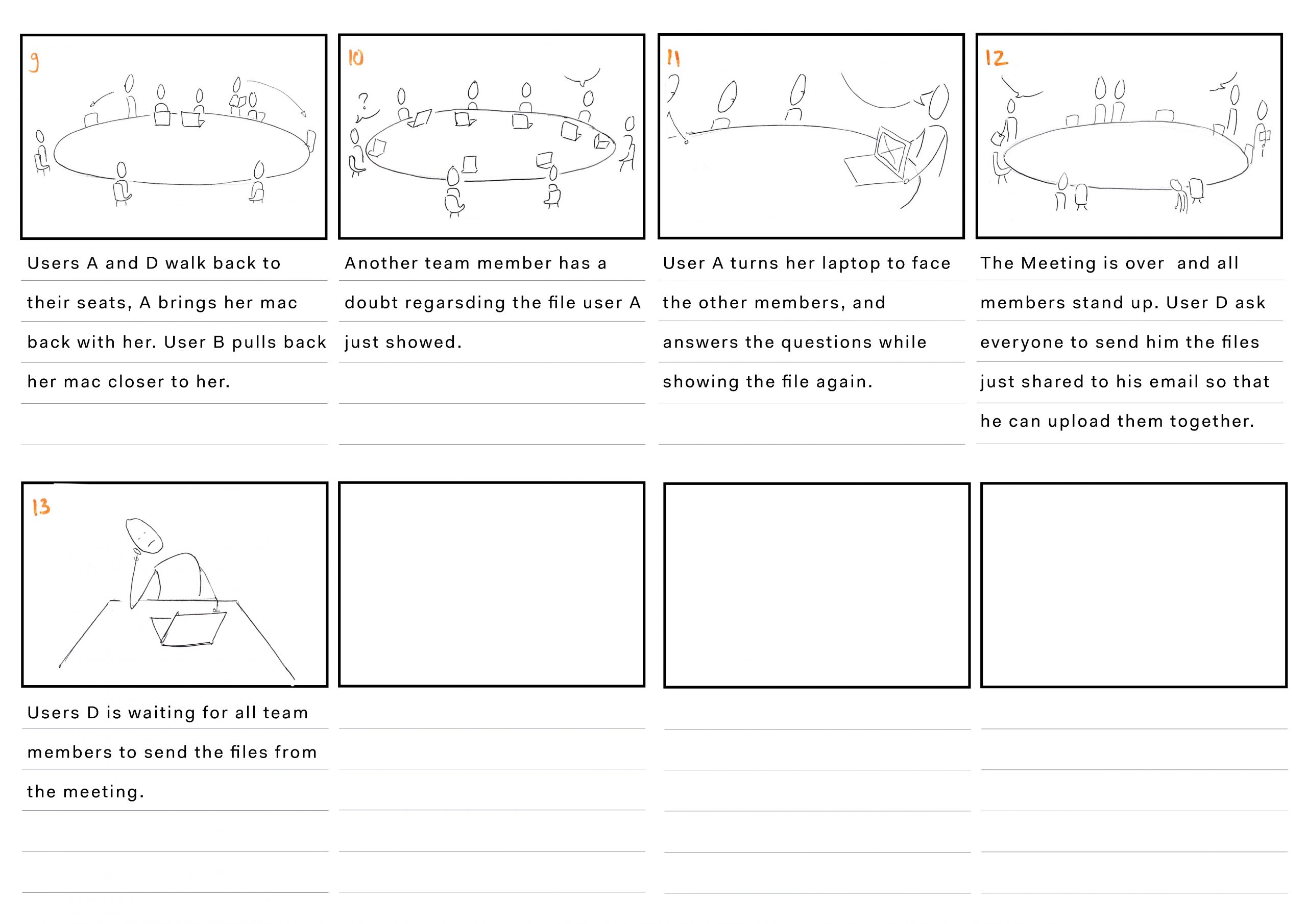
To analyse the product we created a storyboard of how the product is currently being used. Along with that, we created a visual of the flow within the software of the CTOUCH. To get an idea of how good the screen currently performs we did a cognitive walkthrough and peer testing.
Interviews & Observations
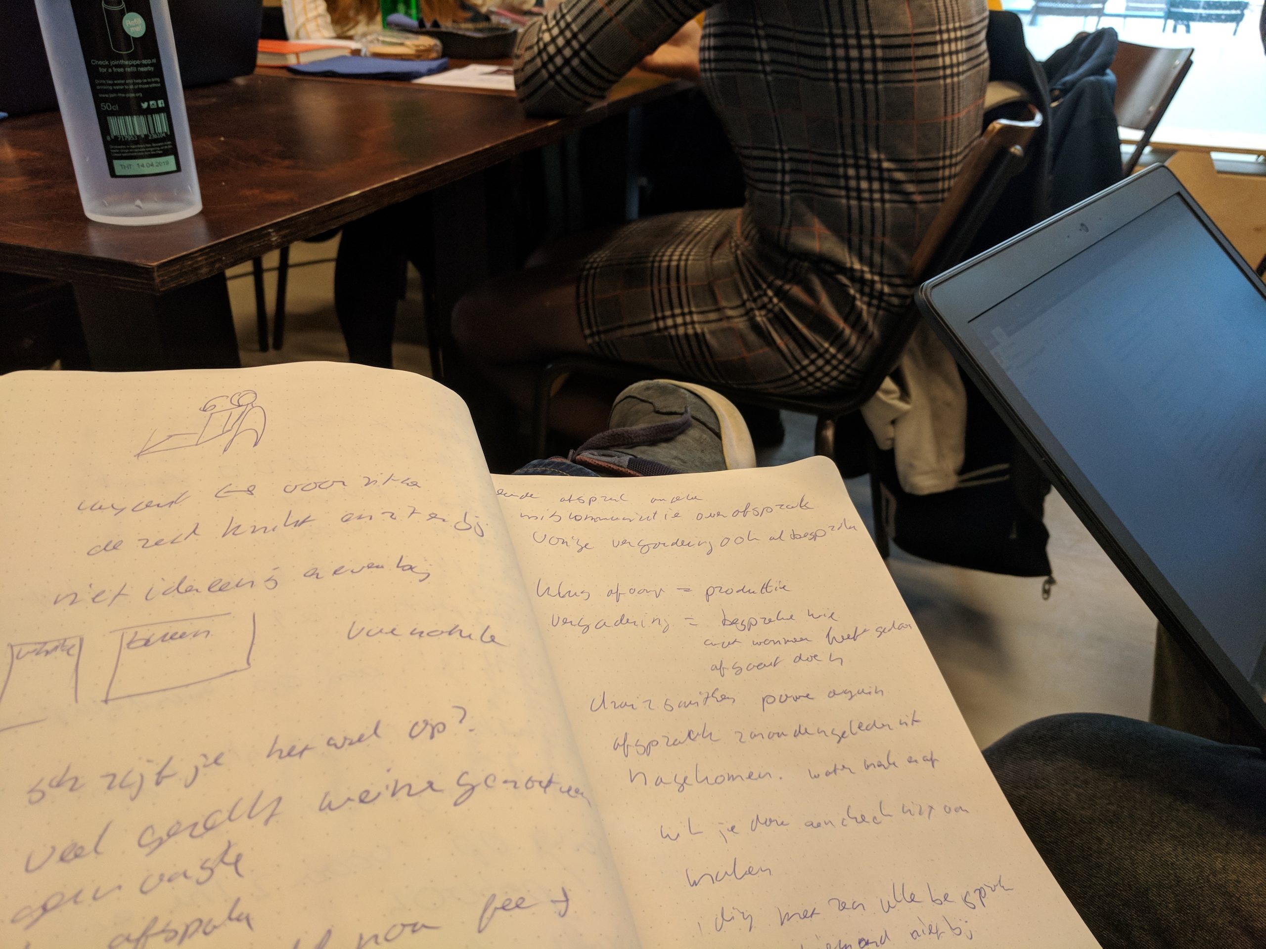
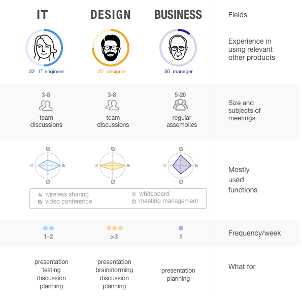
We also wanted to better understand the context in which the CTOUCH is, or could be, used. To do so we send out a questionnaire, did interviews and observations. The questionnaire was about the dynamics of a group during a meeting. The interview was to help us better understands how the CTOUCH could be useful during a meeting and what kind of features is would need. We also observed meetings to understand the flow and dynamic within such meetings.
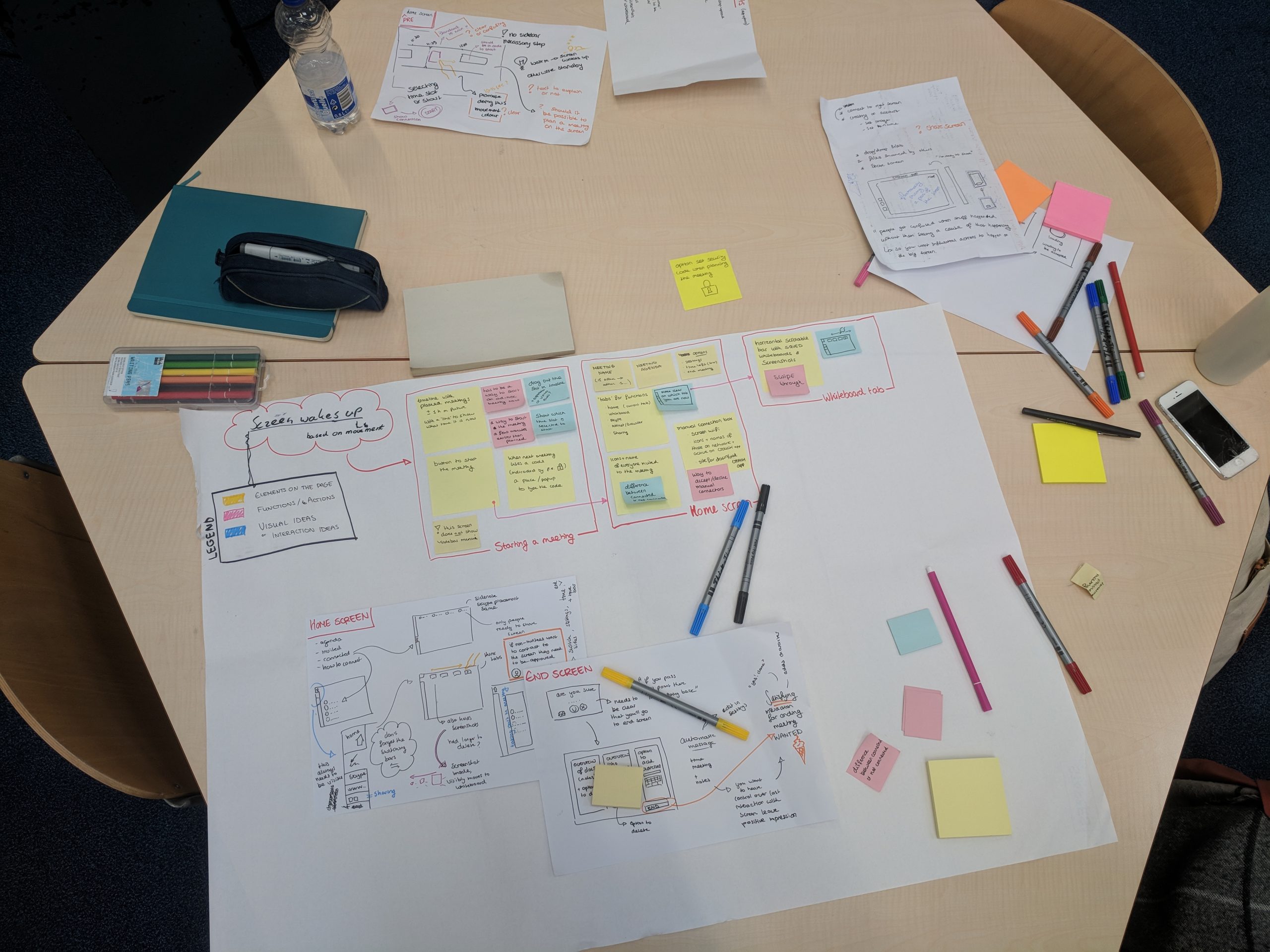
Persona's & Storyboard
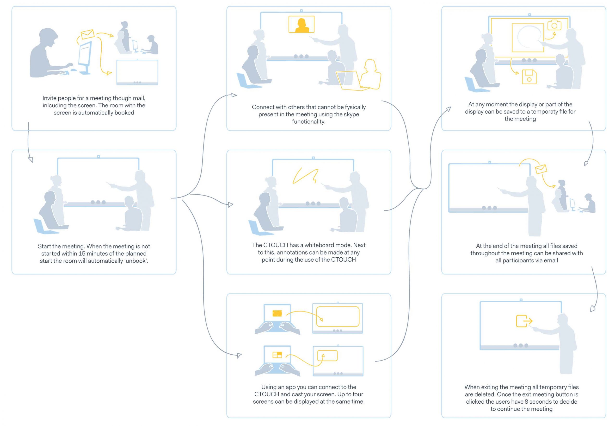
Based on the results of the research, three persona‘s were created. Each persona represents a different usecase of the product. We also created two storyboards, one representing a meeting without the CTOUCH, and the second representing a meeting with the CTOUCH as it is. Below only the first storyboard is shown.
Previous
Next
Based on the performed analysis we came to the following problem statement and ambition.
Problem Statement
The problem is characterized by two core issues: the user journey of connecting multiple devices and the identity of the CTOUCH Leddura 2Meet during meetings.
Ambition
Interaction with the screen should be fluent and organic, as if the team is interacting with another member
Concept redesign
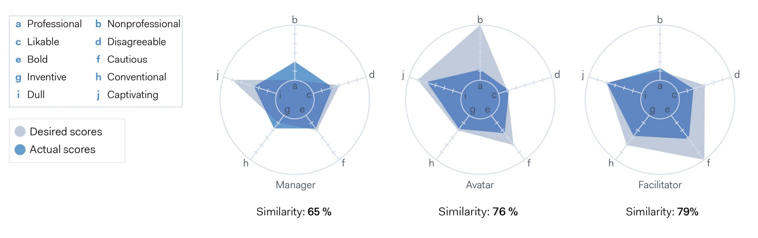
Identity & Feel
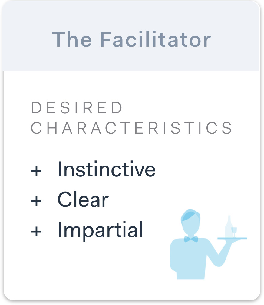
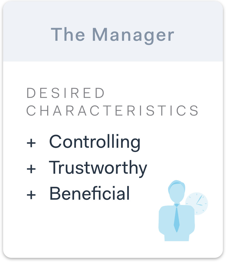
First, we wanted to redesign the overall identity the screen currently has. To do so we created three characters that guided the design and its interaction. The characters are as follow, an avatar, a facilitator and a manager. They differ in that the avatar is helpful and customisable, the facilitator guides the user by providing him with the right information at the right time and the manager is sterner and in control of the meeting, only showing you what he thinks you need.
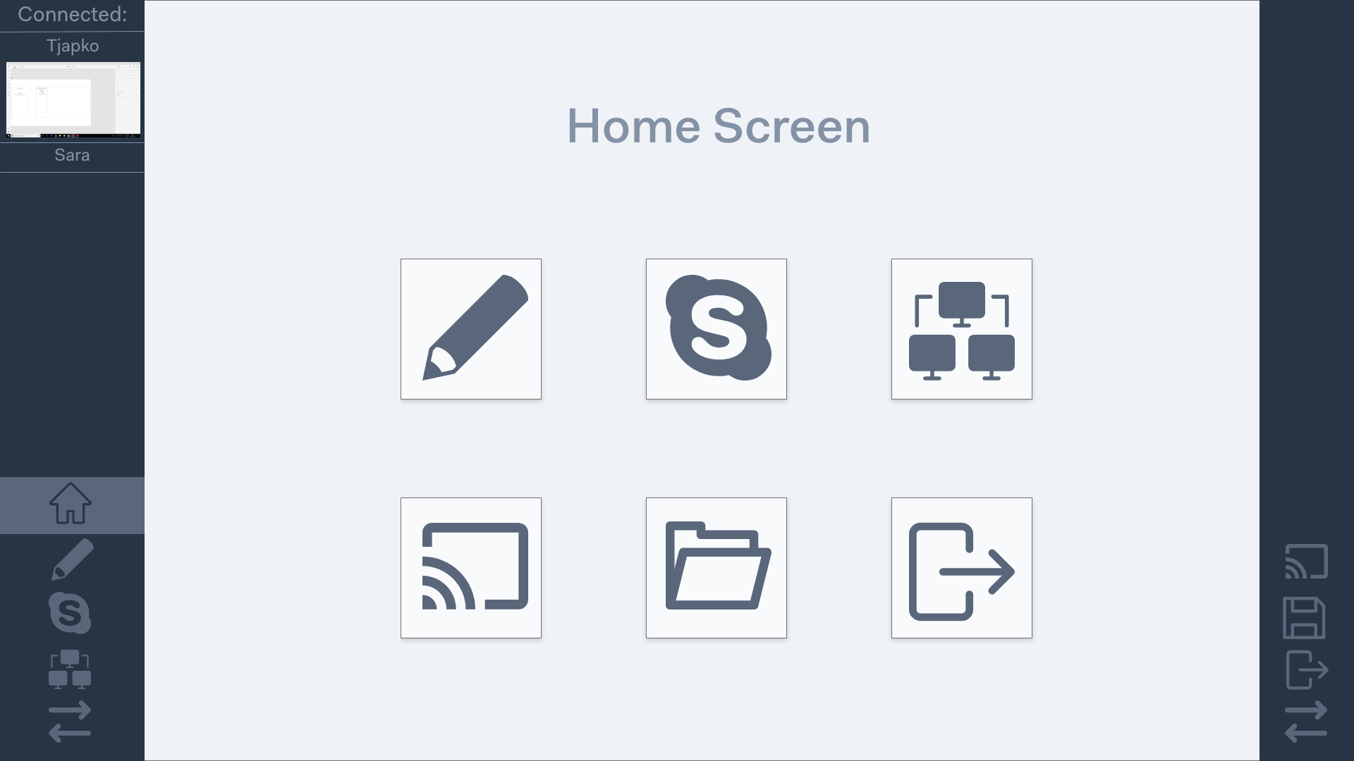
User Flow & Wireframes
For each of these characters, a flow and a set of wireframes was designed.
Previous
Next
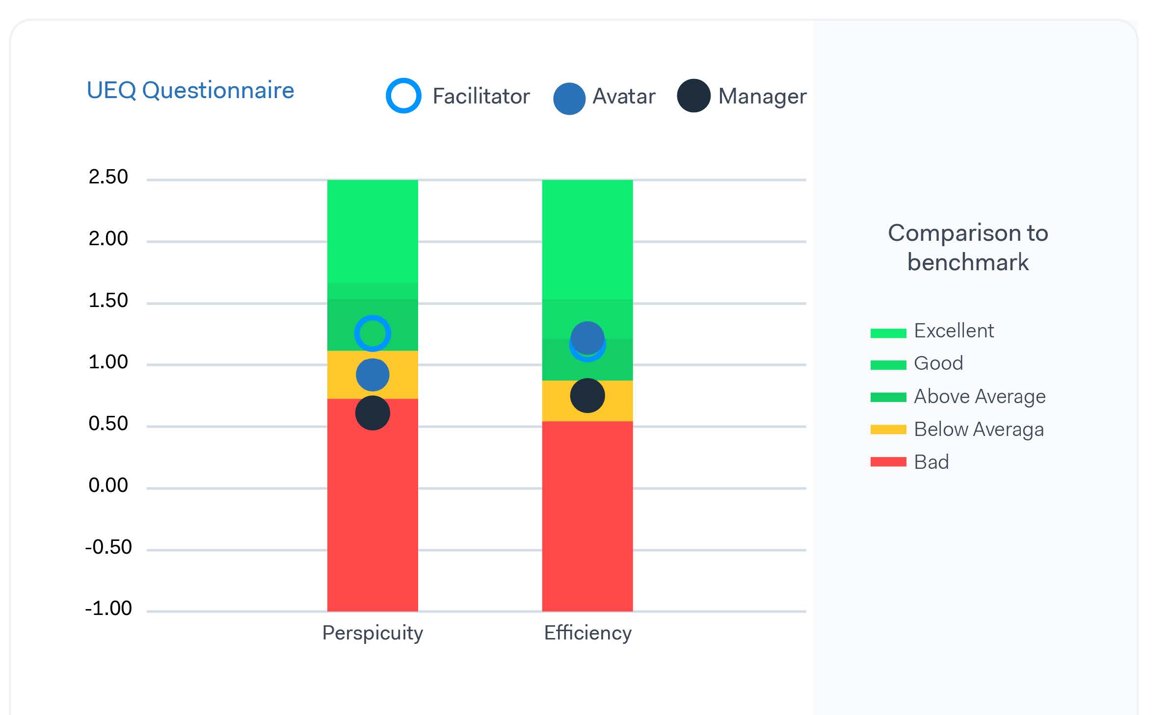
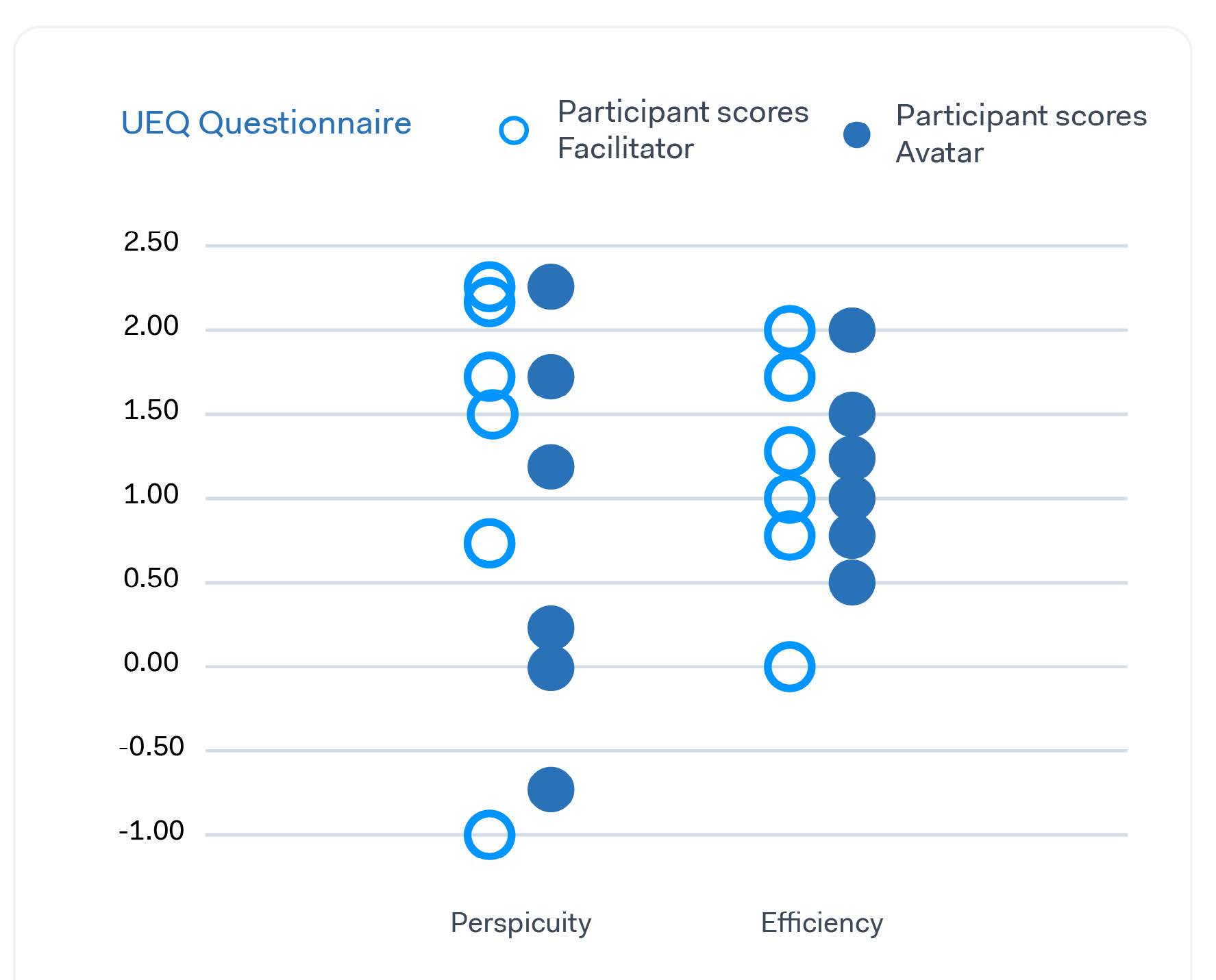
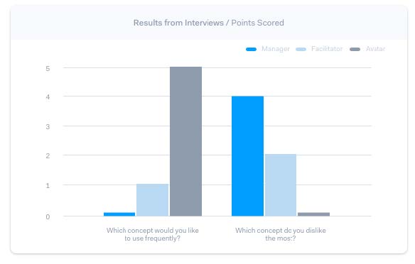
User test
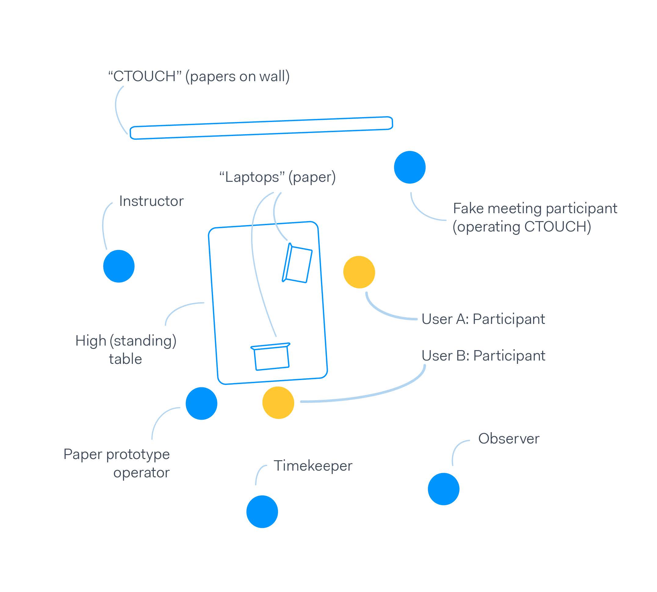
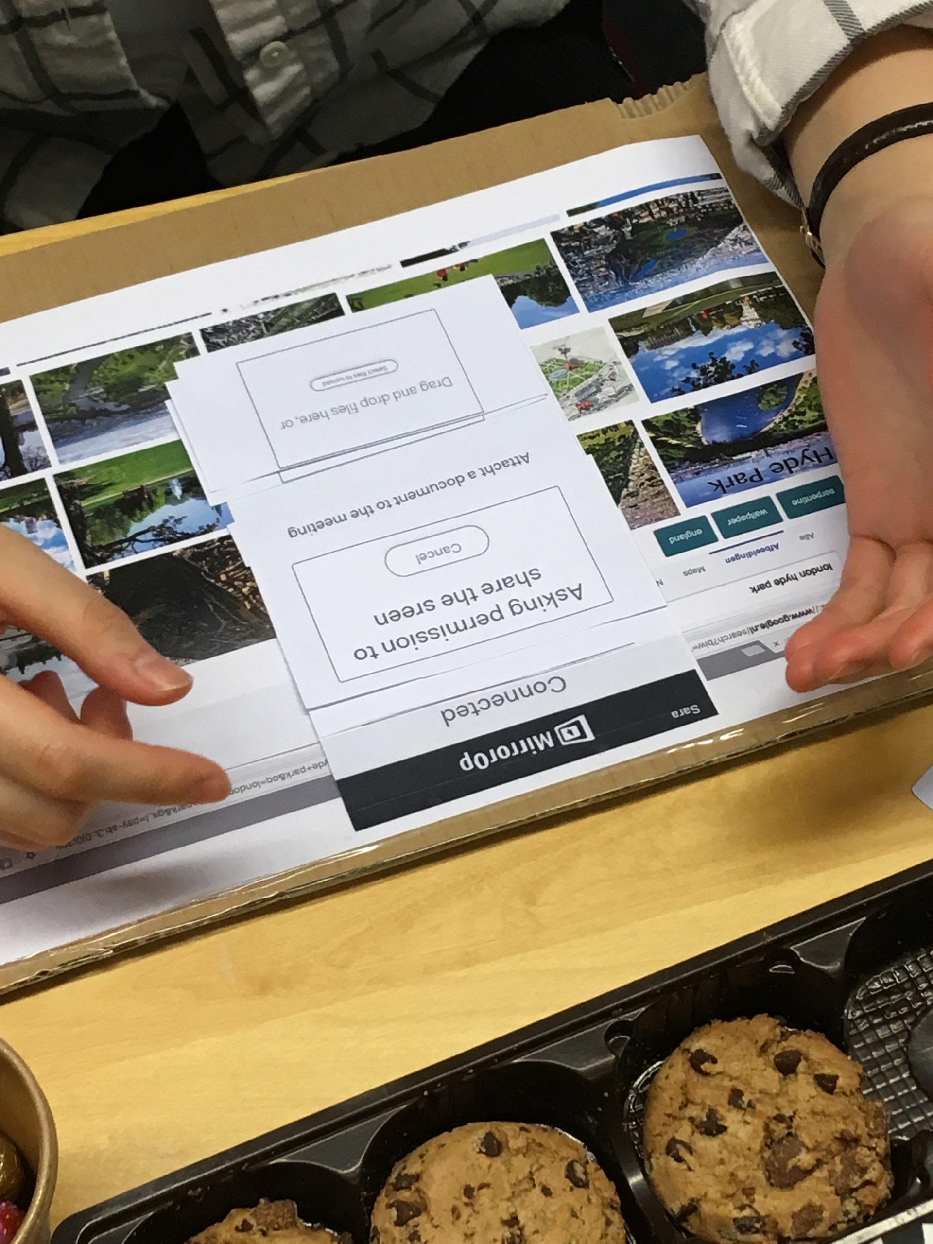
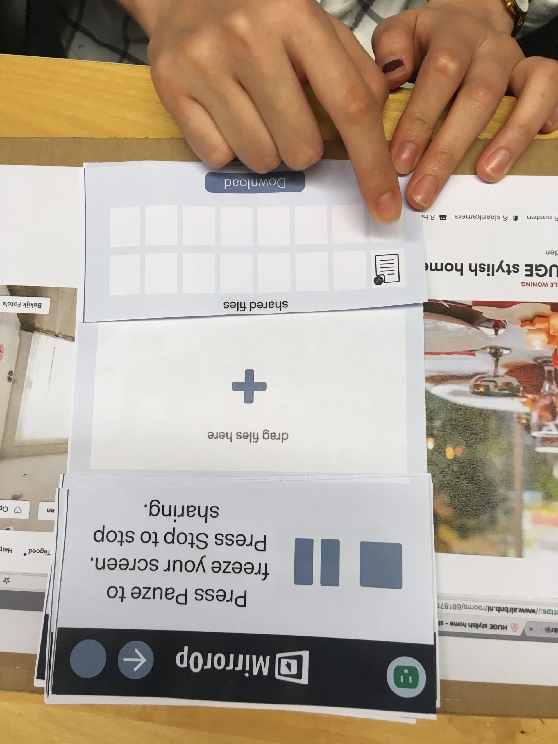
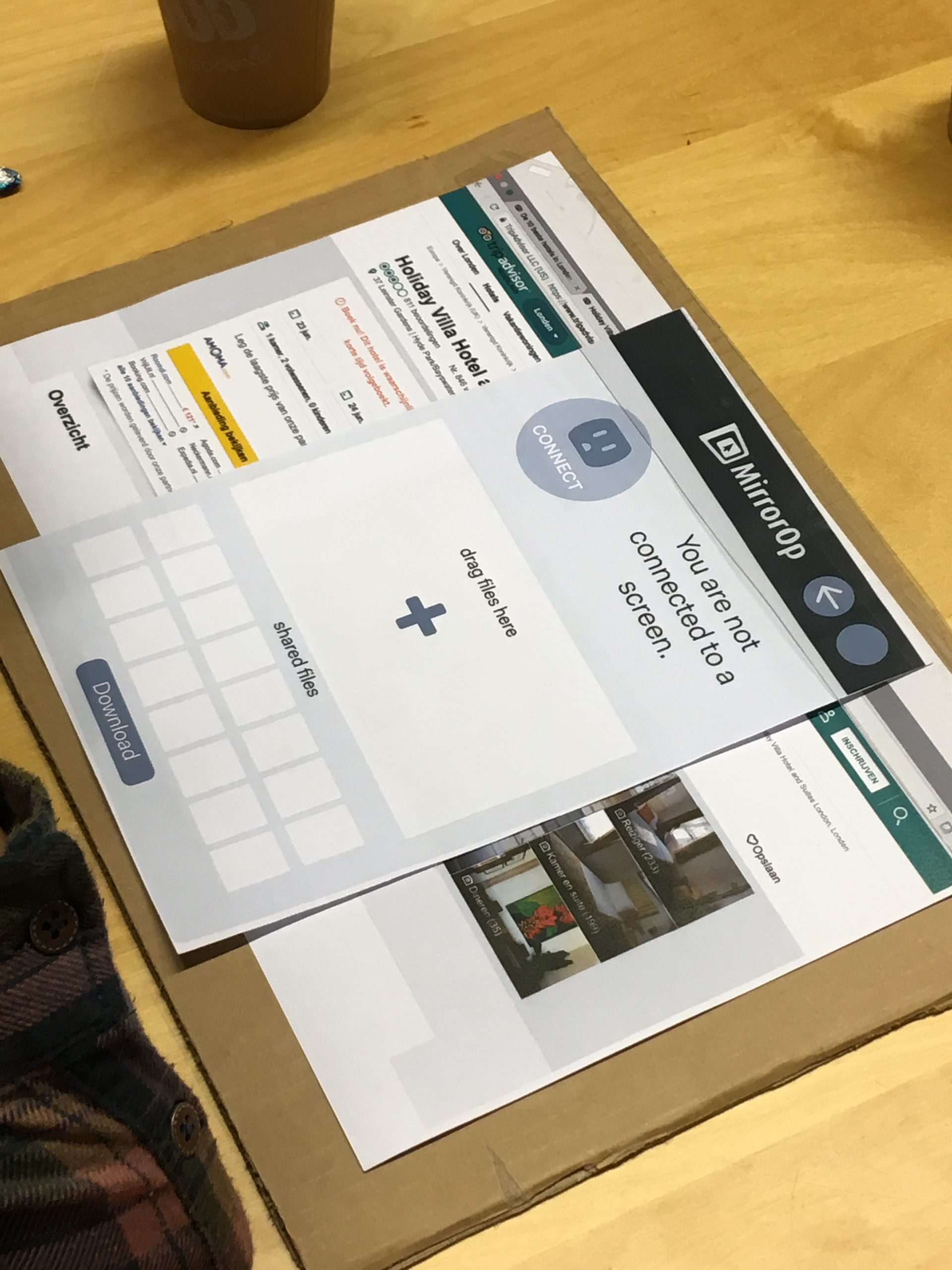
These concepts were put to the test to find, 1 what aspects of each concept work well during a meeting, 2 what is the relative quality of each concept and 3 how clear is the charter in each design to the users. In this test, we simulated a meeting with the CTOUCH using paper prototypes. During the test we observed the participants, afterwards, we interviewed them and they were asked to fill in a questionnaire.
Test analysis
The results of the observation, interview and questionnaire were then analysed. Although not every result gave a significant advantage for a single concept, we were able to use it to converge. Based on the results we converged to a single concept and combined features from different concepts into one.
UX & UI Redesign
Storyboard
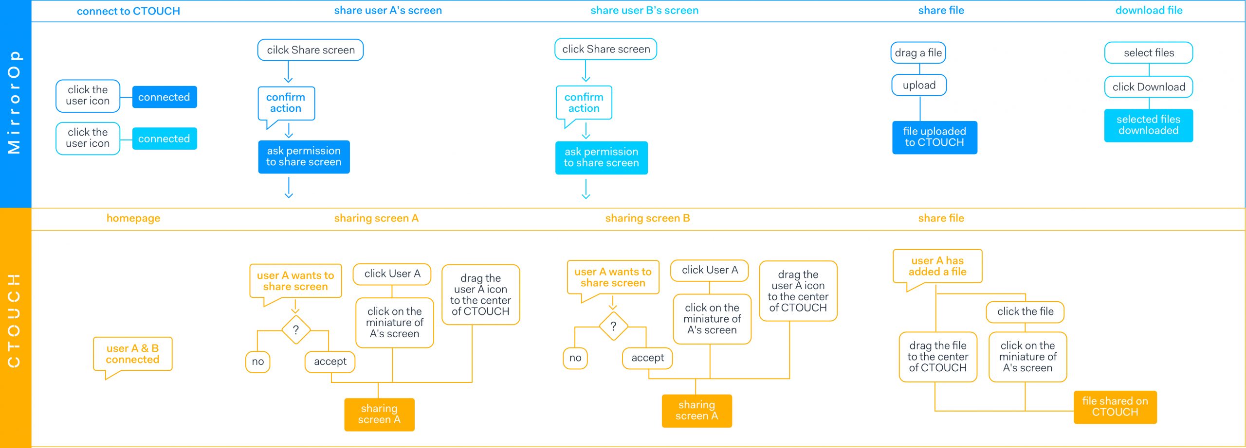
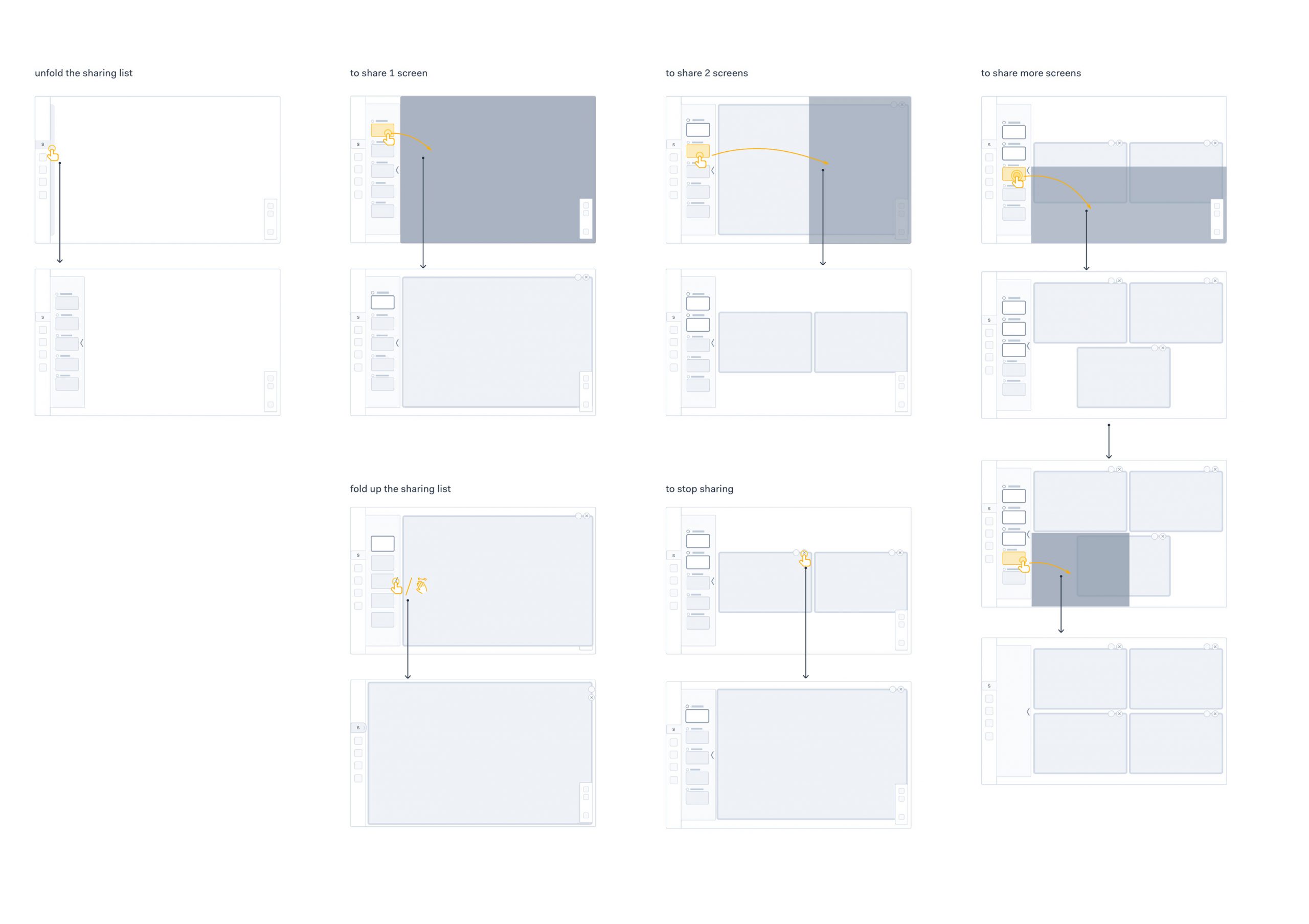
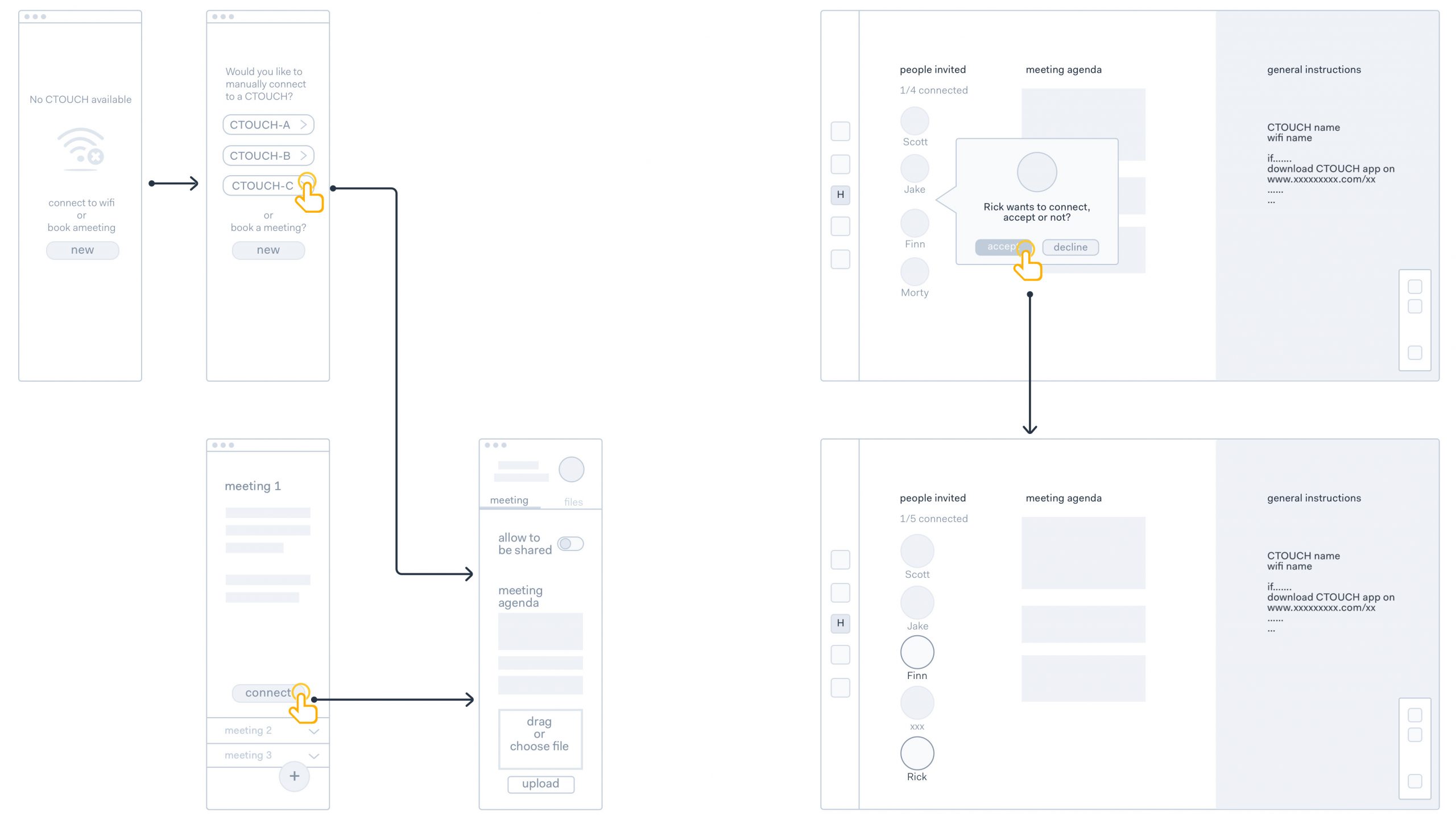
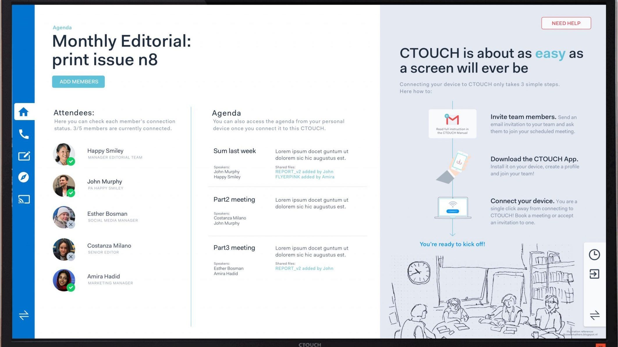
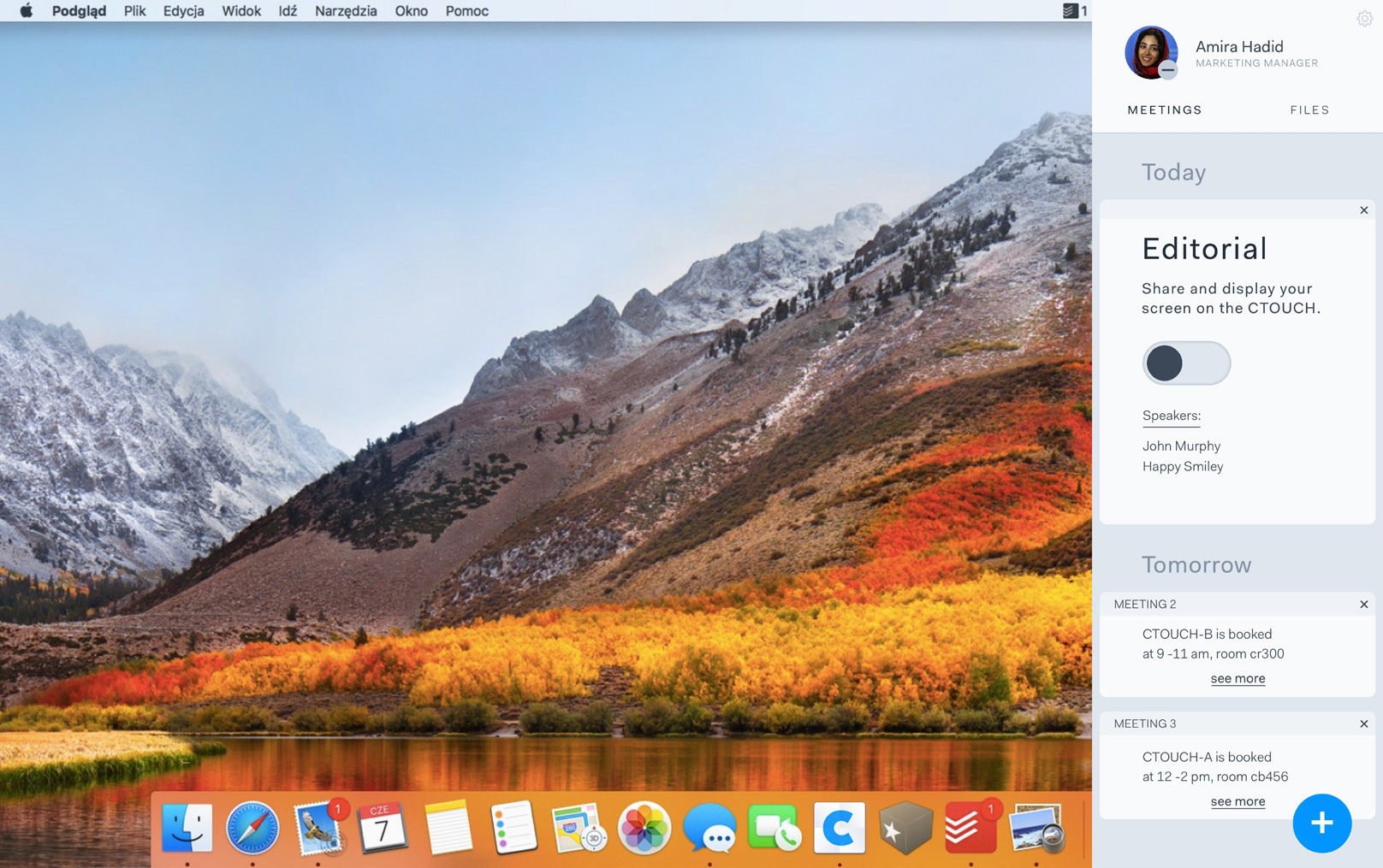
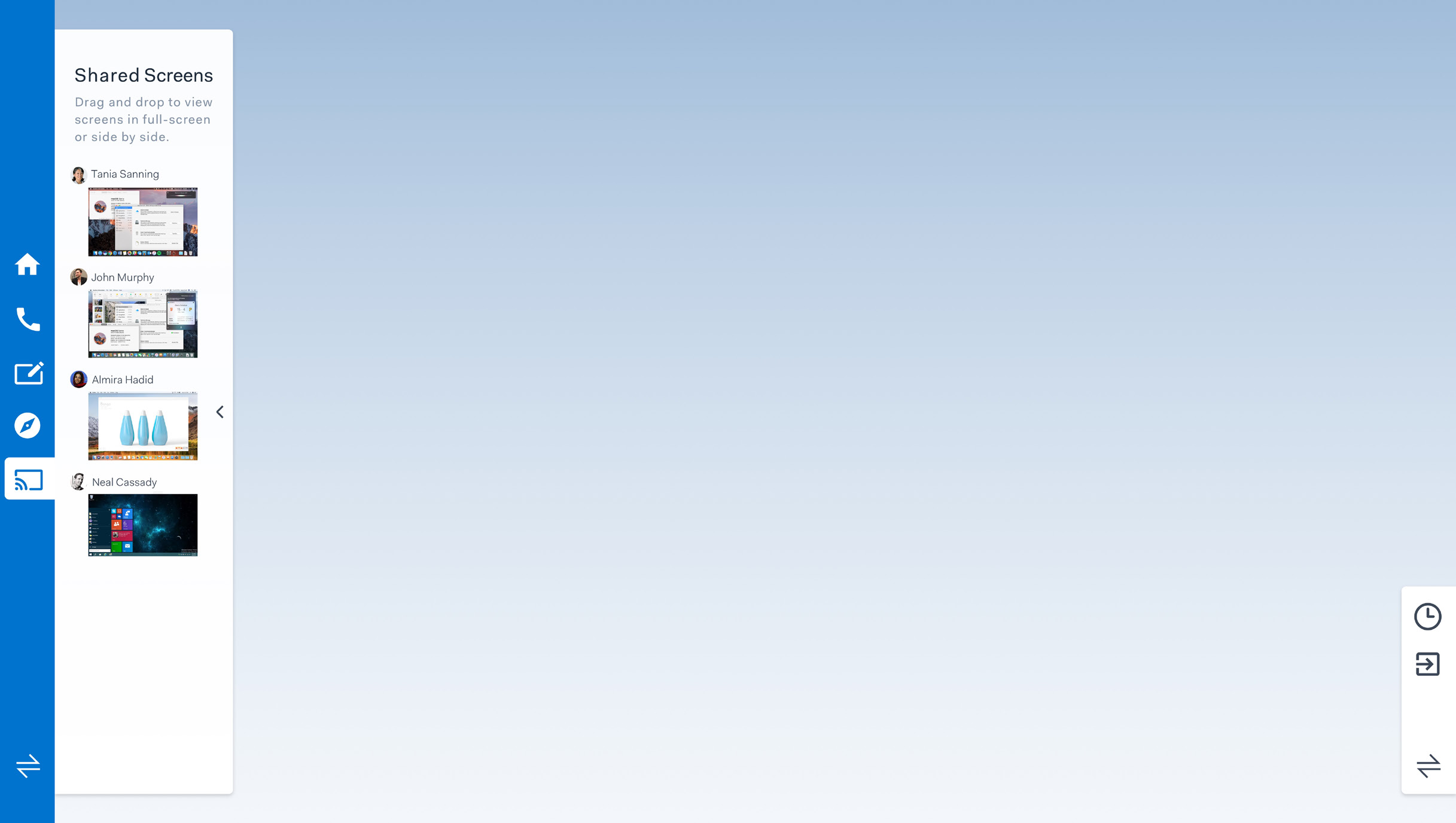
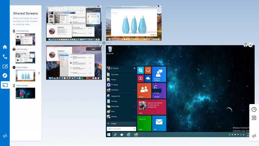
The first step towards a UX & UI was to ensure we got a clear goal to work towards. We focused on optimizing two functionalities of the CTOUCH, connecting your laptop to the screen, and sharing your and other peoples screens. To help us envision how this would look at work we sketched a storyboard of a scenario in which our version of the screen is used.
Functional design & UX
From there we first focused on the functional design UX of both the connecting to the screen and the share of screens. For each, we designed wireframes and the flow of the experience. The aim was to optimize and streamline the experience of using the CTOUCH. We also considered how the interaction should feel.
Having created the wireframes we set out to create a visual style complete our UI. To do so we looked at what kind of applications our target audience uses and used that as reference for creating our own visual style. The applications that we looked to for inspiration were, Zenefits, Slack, Mailchimp and Gusto.
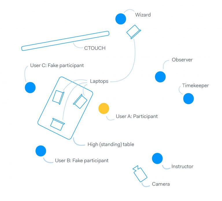
Prototype & Test Setup
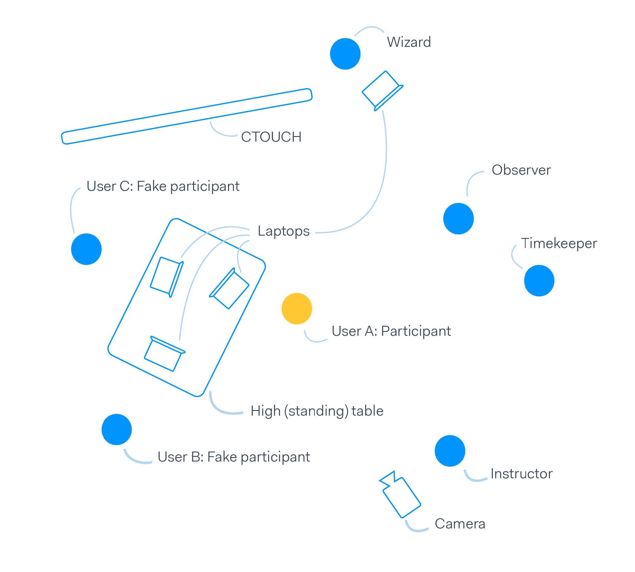
Having created a functional and visual design, we set out to create a prototype that could be used in a user test to validate our design. To create this prototype we used Framer and InVision to create a setup where the user was let to believe the program was actually working. With that, we were able to create a test setup.
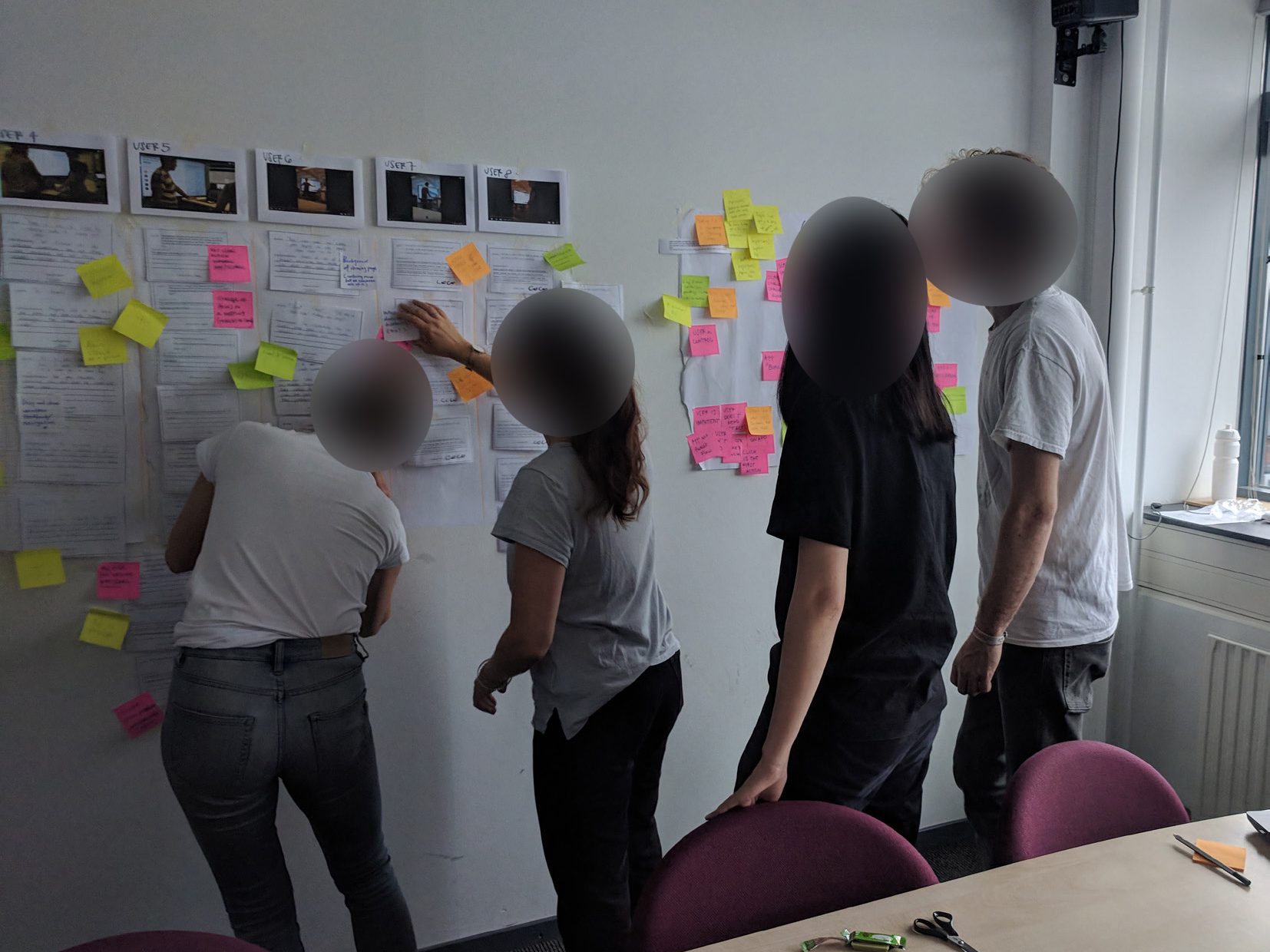
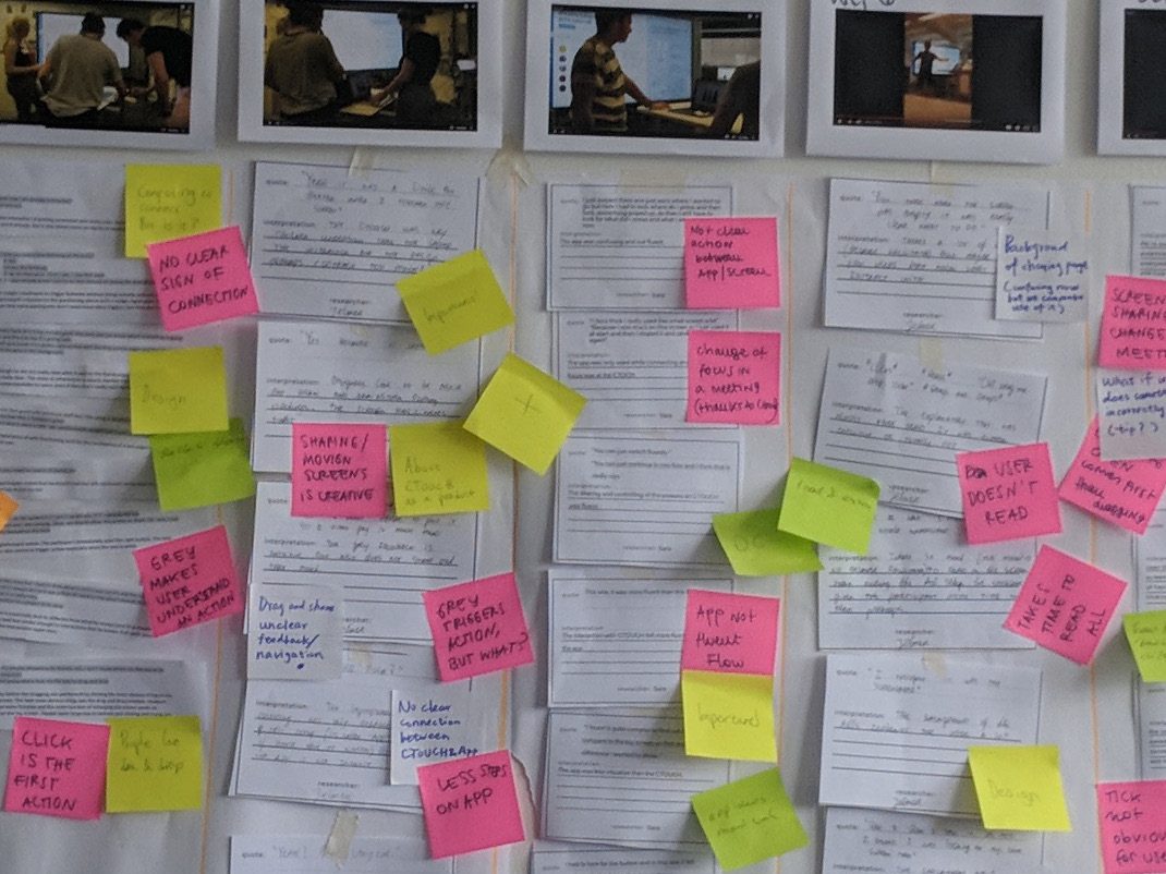
To analyse the user test we transcripted what people set during the user test. Having created a transcript we selected quotes and used an on the wall approach to make sense and find themes in all the data. Using the results we were able to see how much of the ambition we set, in the beginning, we were able to fulfil and make some final adjustments to the design.
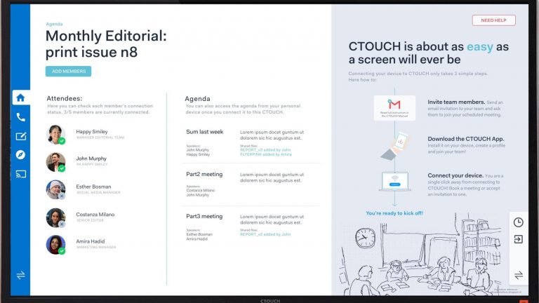
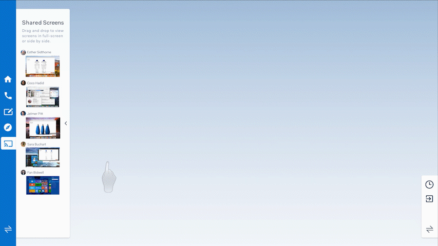
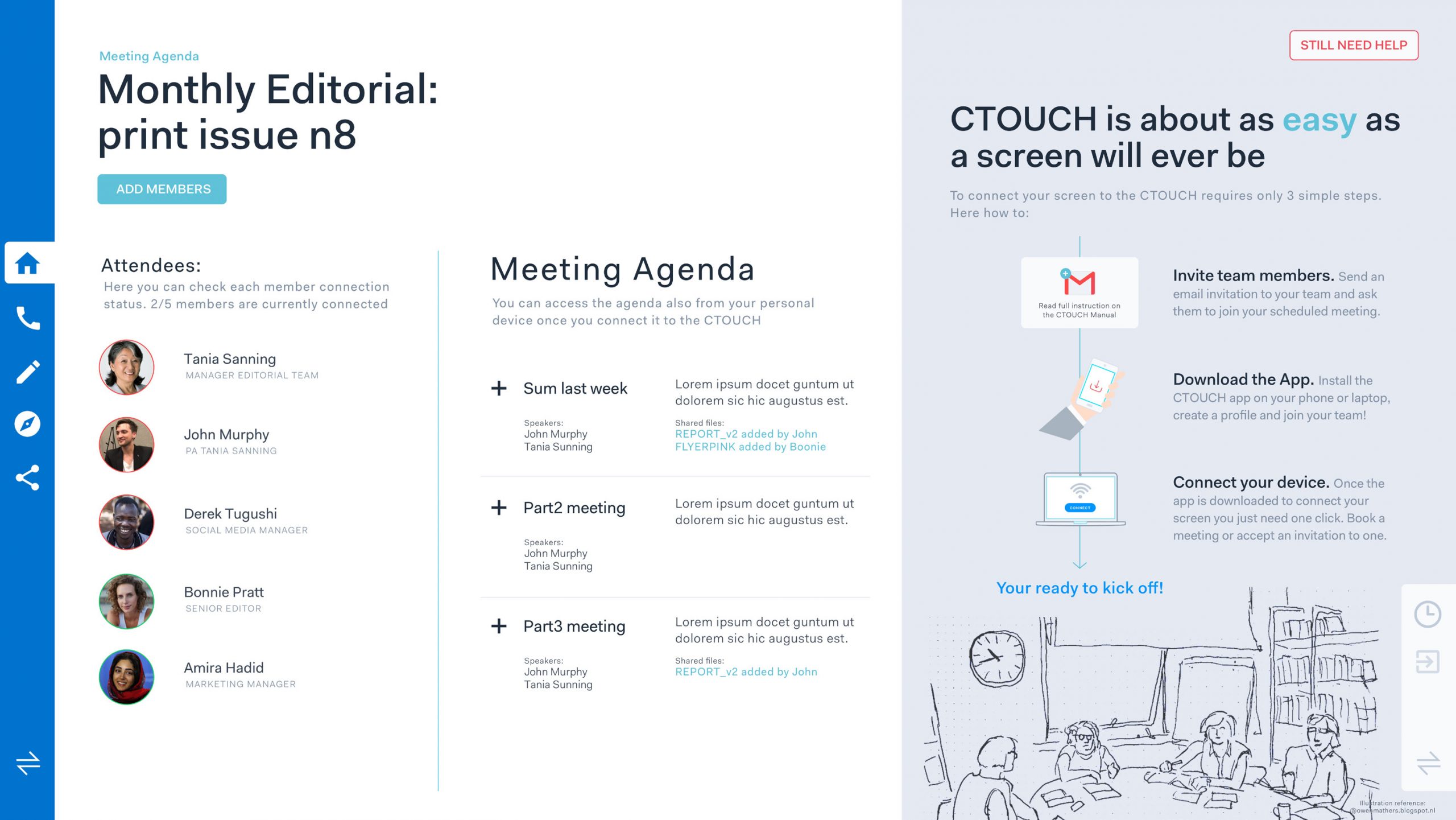
Based on the test results, we created a final iteration of the product, where we optimized the UI, UX and interaction with the product. To show the final design we created a video demonstrating our design & use case of the CTOUCH. Below are also images showing the final design.